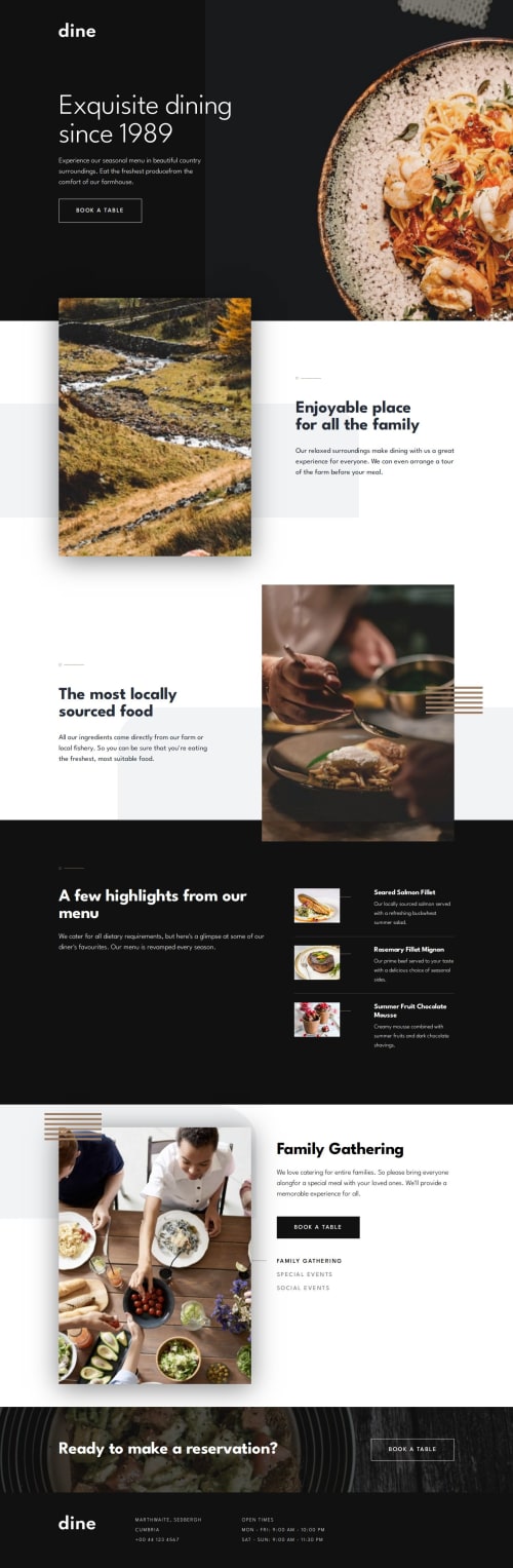
Responsive website using HTML, CSS, and Javascript

Solution retrospective
This project was exciting for me since it was my first multipage website I have worked on. After working on this project, I will be looking more into responsive design and how to effectively make a variety of components and layouts more responsive.
What challenges did you encounter, and how did you overcome them?Finding methods to keep images at certain dimensions while also having a responsive website. I have learned that using max-width and min-width along with using minmax and clamp functions to define a range of dimensions that can help to make components and layouts responsive.
What specific areas of your project would you like help with?I need more help with responsive design and more effective DRY CSS. There are moments were it feels like I am writing too much CSS for something where I can write less using more advance techniques/functions.
Please log in to post a comment
Log in with GitHubCommunity feedback
No feedback yet. Be the first to give feedback on StanishCode's solution.
Join our Discord community
Join thousands of Frontend Mentor community members taking the challenges, sharing resources, helping each other, and chatting about all things front-end!
Join our Discord