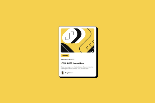
Submitted over 1 year agoA solution to the Blog preview card challenge
Responsive with flex and max-width

@simgeduru
Solution retrospective
What are you most proud of, and what would you do differently next time?
I coded faster than the previous time.
What challenges did you encounter, and how did you overcome them?I had a hard time adjusting the shadow size for phone and desktop. I solved it with the media query.
What specific areas of your project would you like help with?how can I adjust the shadow size without the need for media query? thank you for your help
Code
Loading...
Please log in to post a comment
Log in with GitHubCommunity feedback
No feedback yet. Be the first to give feedback on simgeduru's solution.
Join our Discord community
Join thousands of Frontend Mentor community members taking the challenges, sharing resources, helping each other, and chatting about all things front-end!
Join our Discord