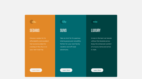
Submitted almost 4 years agoA solution to the 3-column preview card component challenge
Responsive with flexbox

@AlazarG19
Solution retrospective
my question is my browser doesnt display a 1440 px version of the site when i build it why is that
Code
Loading...
Please log in to post a comment
Log in with GitHubCommunity feedback
No feedback yet. Be the first to give feedback on Alazar Getachew's solution.
Join our Discord community
Join thousands of Frontend Mentor community members taking the challenges, sharing resources, helping each other, and chatting about all things front-end!
Join our Discord