responsiveness was done with flexbox

Solution retrospective
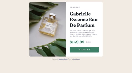
it was difficult working with the desktop image, as i was trying to fit it into a 500px height container. i set the height of the image to be 100% but it ignored the height container and maintained its predefined height. Tried different values, went back and forth my code to see of i made any mistakes but i found nothing. i later had to set the container to take the height of the image. if there is a way around this, i'd really love to know.. All feedbacks are welcome...
Please log in to post a comment
Log in with GitHubCommunity feedback
- @dj-drakos
Hey @GREATEMMET, good work on this.
I took a peek at your repo, and noticed you're now using the width property to control the image size, which seems to be working! Nice.
Without playing around with your code, I'm wondering if the issue you're having has to do with how CSS treats the height property. If the parent element (
.desktop-img) doesn't have an explicitly defined height, CSS will ignore the height you set on the child (img). That explicitly defined height could be set on the.desktop-imgdiv, or be inherited from its parent... Lots of different approaches.CSS-Tricks has a good post that goes more in depth.
Marked as helpful - @alishirani1384
Hi @GREATEMMET you did a very excellent job on this challenge to make it center both vertically and horizontally you can add this code to your body:
body{ min-height: 100vh; display: flex; align-items: center; justify-content: center; flex-direction: column; }Marked as helpful - @correlucas
👾Hello @GREATEMMET, Congratulations on completing this challenge!
Your solution its almost done and I’ve some tips to help you to improve it:
Add the website favicon inserting the svg image inside the
<head>.<link rel="icon" type="image/x-icon" href="./images/favicon-32x32.png">A better way to work this solution image, the product image is by using
<picture>to wrap it on the html instead of using it as<img>orbackground-image(with the css). Using<picture>you wrap both images (desktop and mobile) and have more control over it, since you can set in the html when the images changes setting the screen size for each image.ote that for SEO / search engine reasons isn’t a better practice import this product image with CSS since this will make it harder to the image.Here’s the documentation and the guide to use this tag:
https://www.w3schools.com/tags/tag_picture.aspSee the example below:
<picture> <source media="(max-width:650px)" srcset="./images/image-product-mobile.jpg"> <img src="./images/image-product-desktop.jpg" alt="Gabrielle Parfum" style="width:auto;"> </picture>👨💻Here's my solution for this challenge if you wants to see how I build it: https://www.frontendmentor.io/solutions/product-preview-card-vanilla-css-and-custom-hover-state-on-hero-85A1JsueD1
✌️ I hope this helps you and happy coding!


Join our Discord community
Join thousands of Frontend Mentor community members taking the challenges, sharing resources, helping each other, and chatting about all things front-end!
Join our Discord