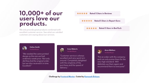
Responsive-Social-Proof-Section made with CSS Grid and Flexbox.

Solution retrospective
Hello Frontendmentors, I am back with another solution which was fun coding. I had a great experience in this one. Well I wanted to use the (srcset attribute) this time for the background svg to switch from mobile to desktop without downloading both svg to the browser which can waste more user bandwidth. but I was not able to it. Anyone here who can help? Also what is the difference in using the <picture> tag compared to the srcset attribute. Do they perform the same task?
Please do not forget to like and suggest on this solution. It is a pleasure.
Please log in to post a comment
Log in with GitHubCommunity feedback
No feedback yet. Be the first to give feedback on Kamasah-Dickson's solution.
Join our Discord community
Join thousands of Frontend Mentor community members taking the challenges, sharing resources, helping each other, and chatting about all things front-end!
Join our Discord