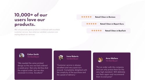
Submitted over 4 years agoA solution to the Social proof section challenge
Resposive layout with media queries

@ezzep66
Solution retrospective
I hope I'm making improvements since my first submission.
Code
Please log in to post a comment
Log in with GitHubCommunity feedback
- @lukebergmann
Hey ezzep66, this looks really awesome, great job! I would suggest spacing the bottom plum coloured boxes a little further apart and making box shape slightly more rectangle rather than square!
Cheers!
Luke
- @ApplePieGiraffe
Hey, good work on this challenge, ezzep66! 👍
Your solution looks good and responds rather well! 👏
I suggest,
- Adding a
max-widthto the main container or wrapper so that the content of the page doesn't look too stretched on extra-large screens. - Getting rid of the extra space at the bottom of the testimonial cards in the mobile layout of the site.
Keep coding (and happy coding, too)! 😁
- Adding a


Join our Discord community
Join thousands of Frontend Mentor community members taking the challenges, sharing resources, helping each other, and chatting about all things front-end!
Join our Discord