Not Found
Not Found
Not Found
Not Found
Not Found
Not Found
Not Found
Not Found
Not Found
Not Found
Not Found
Not Found
Not Found
Not Found
Not Found
Not Found
Not Found
Not Found
Not Found
Not Found

Submitted

REST Countries API

P
Sook-Yan Hue• 40

@syhue

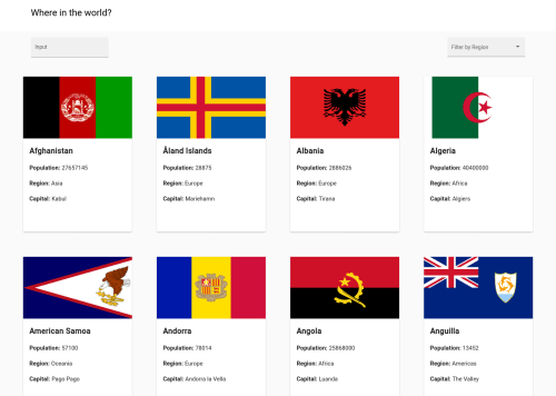
Desktop design screenshot for the REST Countries API with color theme switcher coding challenge

This is a solution for...

  • HTML
  • CSS
  • JS
  • API
4advanced
View challenge

Design comparison


SolutionDesign

Solution retrospective


Still not sure how to toggle the dark or white theme using angular material. Will improve my skill on it.

Do appreciate and welcome any reviews on my code.

Community feedback

JOHIRKHAN12• 0

@JOHIRKHAN12

Posted

learn more html dd [url=https://beginnerwebdeveloper.com/blog/html-dd/]html dd [/url]

1
P
Grace• 27,950

@grace-snow

Posted

Hi,

I'm not very experienced with React (really don't enjoy using it, like @demahom18 I'm a Vue.js girl when it comes to frameworks!)

But I've had a look in browser and have some ideas for you :)

Firstly, really nice effect on your search input label! I like that a lot.

Overall, this looks nice on mobile and desktop, but you do have quite a problem with images being misshapen. This becomes really obvious at some screen sizes with images being stretched or squished.

There is a brand new aspect ratio property in css that would be good to learn about, but it would be important to wrap that inside an @supports media query if you chose to use it, as not all browsers have it yet (they will in the next few months).

Even if you did use that, you'd need to include a fallback for all other browsers. This article may help, but there are lots of others explaining the same approach: https://www.w3schools.com/howto/howto_css_aspect_ratio.asp. To maintain the aspect ratio you may find it easier if you used background images instead of placing the image as an element in html. We do this a lot where I work and add these style="background-image: url('path-to-image')" role="img" alt="flag of USA" to the element so it is still announced to assistive technology.

The overall layout on this is OK, but I think you'd find it more fluid if you used CSS grid. It's the perfect use case for it!

Be careful to make focus states obvious, especially when keyboard tabbing. You could use the :focus-visible css property to give buttons and cards a bolder focus outline, for example. Color change only on focus really isn't enough to meet accessibility requirements as some with sight impairments like types of colorblindness will not be able to see what has focus.

Last thing - you're using some incorrect html elements in this. The information inside the cards can't be h4s. There's a few reasons here - 1) You should never jump heading levels as they give meaningful structure for search engines and assistive tech users; 2) Headings need to have content under them, they can't be the only content to read.

Instead of h4s, I recommend switching to the description list element which is designed specifically for this type of content.

i hope that's all helpful feedback. It's not a list of criticisms or anything, just learning suggestions really 🙂

2

P
Grace• 27,950

@grace-snow

Posted

Oh and in your report, a lot of those html validation errors are because it doesn't understand the custom attributes React is adding. Don't worry about those ones.

Some are real though, like ones talking about the order of -ms- prefixes in css. If you use any prefixed properties or need to include fallbacks for new/less-supported properties, make sure these always come before the modern properties in css. (With most, I'd argue you don't even need to be including them at all, to be honest. Build tools can add them for you automatically if/when needed, so you don't need to include them yourself)

For example:

display: -ms-grid;
display: grid;

This is all to do with the cascade in CSS. If a browser supports a property like grid, it'll use that. If it doesn't, it will look higher to see if an alternative is available

0
P
Sook-Yan Hue• 40

@syhue

Posted

@grace-snow

Thanks for the detailed review of my code. Thank you so much. I will read line by line and take notes of it. Thanks again.

0
Mohamed Donzo• 165

@demahom18

Posted

Hey how you doing, I just did the same few days ago (with Vue 3) and I can help with some little advices:

  1. the short name you get is the alpha3Code. You have to find the country's full name by the alpha3Code.
  2. Google (prefers-color-scheme) you will find how to do it
  3. Can't say much about your code. I dont know react
1

P
Sook-Yan Hue• 40

@syhue

Posted

@demahom18

Thank you so much for your tips. Appreciate it. :D and, I am actually using Angular Framework. XD

0

Please log in to post a comment

Log in with GitHub
Discord logo

Join our Discord community

Join thousands of Frontend Mentor community members taking the challenges, sharing resources, helping each other, and chatting about all things front-end!

Join our Discord