


@AlexBueckig
Posted
Hi @silashuereca,
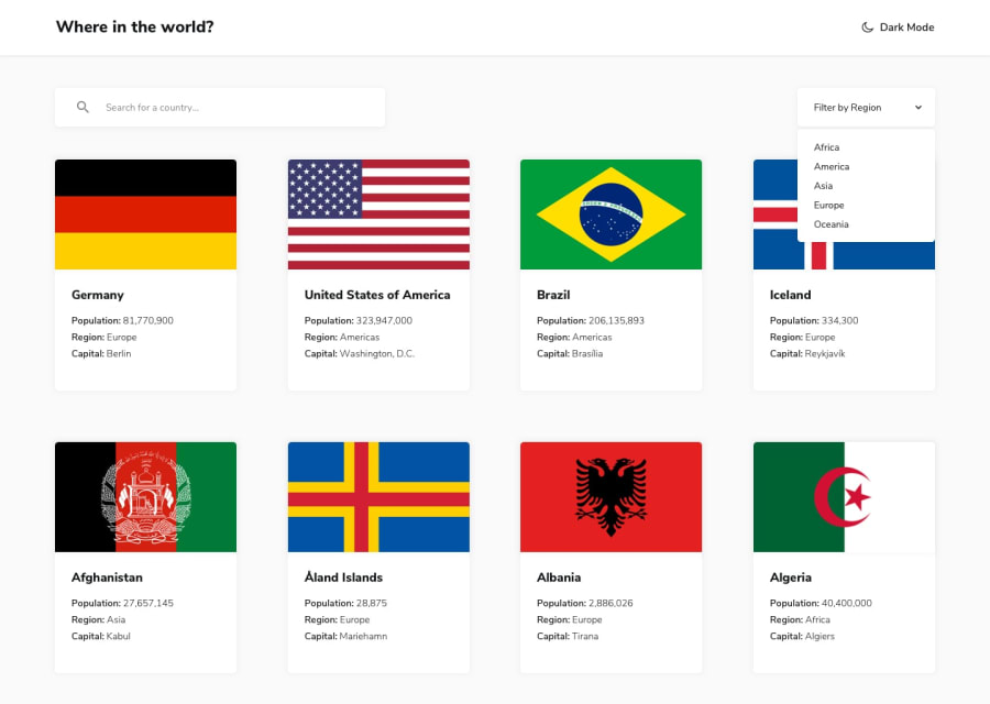
I'm currently reworking my REST-Api project and I started using react-select as replacement for the standard HTML select tag.
Currently I came to the conclusion that the easiest way to style the components is using both props className and classNamePrefix.
I'll quote something from the docs right now, I hope it clears things up a bit! 😃
For example, given className='react-select-container' and classNamePrefix="react-select", the DOM structure is similar to this:
<div class="react-select-container">
  <div class="react-select__control">
    <div class="react-select__value-container">...</div>
    <div class="react-select__indicators">...</div>
  </div>
  <div class="react-select__menu">
    <div class="react-select__menu-list">
      <div class="react-select__option">...</div>
    </div>
  </div>
</div>
To sum it up, every element gets a className which you can use to style it then. The control e.g. is the typical select box with the dropdown arrow you normally see while nothing has been clicked. The menu on the other hand are the options, which show up as soon as you click on the control.
Btw... Here is the link to the docs if you want to check out the other options aswell. https://react-select.com/styles
Edit: Here are some usefull classes for styling the options I just found out about... Unfortunately the docs are kinda bad at describing all the different class variations... Either that or I'm just blind... 🙄
.react-select__option:hover {}
.react-select__option:focus {}
.react-select__option:active {}
.react-select__option--is-focused {}
.react-select__option--is-selected {}
@silashuereca
Posted
This actually clears everything up! Thank you so much for this!
