Countries app using react, react router dom,

Solution retrospective
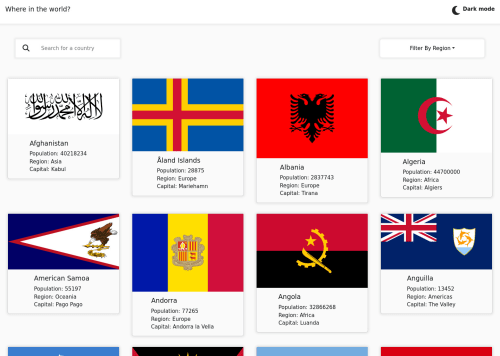
Here it is... my first advanced solution!
I'm feeling very proud of myself for how far I've come and I am very grateful to Frontend Mentor for helping me throughout my coding journey!
I'd like to improve the style of the cards and wonder how I can get them to stay consistent when filtered out
The dropdown menu gave me problems and I just used a react bootstrap template for the styling. As far as the functionality goes, I was struggling to filter out the countries properly since the filter method kept slicing the original array I was using to render the countries. In the end, I figured out how to render them using the useEffect hook although I don't know if its the best way to do it.
Please leave feedback!
Happy coding!
--Matt
Please log in to post a comment
Log in with GitHubCommunity feedback
No feedback yet. Be the first to give feedback on Matthew Van Pelt's solution.
Join our Discord community
Join thousands of Frontend Mentor community members taking the challenges, sharing resources, helping each other, and chatting about all things front-end!
Join our Discord