Skip to content
  • Unlock Pro
  • Log in with GitHub
Solution
Submitted over 1 year ago

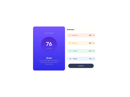
Result Summary Design

Omlan•110
@omlan99
A solution to the Results summary component challenge
View live sitePreview (opens in new tab)View codeCode (opens in new tab)

Solution retrospective


Did my first design of front end project from Frontendmentor. It's not responsive for mobile device.

Code
Select a file

Please log in to post a comment

Log in with GitHub

Community feedback

  • Osman Bay•690
    @osmanbay90
    Posted over 1 year ago

    Great job on completing the Frontend Mentor challenge! Your project shows promise, but here are some areas where you could make improvements in your HTML and CSS:

    1. Semantic HTML: Ensure you use appropriate HTML elements for each piece of content. For instance, use <main> tags and wrap cards to improve accessibility. Replacing the first child <div> of the <body> with <main> can enhance the structure.

    2. Remove Unnecessary Code: Less is more! Eliminate any unnecessary code. For example, remove HTML comments and avoid redundant CSS properties. Clarity and simplicity are key.

    3. Responsive Images: Give images a max-width of 100% to ensure responsiveness across different devices. Also, consider adding a border-radius value for a polished look.

    4. Typography Consistency: Maintain consistent font sizes, text alignment, and margins. For instance, set h1 and p font size to 15px (0.9375rem), align text to the center, and apply consistent margins.

    5. Flexbox and Grid: Explore these layout techniques to create responsive designs. Flexbox is great for one-dimensional layouts, while CSS Grid handles two-dimensional layouts effectively.

    6. Accessibility: Use semantic elements like <nav>, <article>, and <section> to improve screen reader compatibility. Add alt attributes to images for better accessibility.

    7. CSS Variables: Leverage custom properties (CSS variables) for consistent color schemes, font sizes, and spacing. This makes it easier to maintain and update styles.

    8. Organized CSS: Group related styles together. Use separate CSS files for different components or sections. Avoid inline styles whenever possible.

    9. Mobile-First Approach: Start designing for mobile screens first, then progressively enhance for larger screens. This ensures a better user experience across devices.

    10. Browser Compatibility: Test your design on different browsers (Chrome, Firefox, Safari, Edge) to ensure consistent rendering. Use vendor prefixes for CSS properties if needed.

    Remember, practice makes perfect! Keep refining your skills by tackling more challenges on Frontend Mentor. Happy coding! 🚀

    Marked as helpful

Join our Discord community

Join thousands of Frontend Mentor community members taking the challenges, sharing resources, helping each other, and chatting about all things front-end!

Join our Discord
Frontend Mentor logo

Stay up to datewith new challenges, featured solutions, selected articles, and our latest news

Frontend Mentor

  • Unlock Pro
  • Contact us
  • FAQs
  • Become a partner

Explore

  • Learning paths
  • Challenges
  • Solutions
  • Articles

Community

  • Discord
  • Guidelines

For companies

  • Hire developers
  • Train developers
© Frontend Mentor 2019 - 2025
  • Terms
  • Cookie Policy
  • Privacy Policy
  • License

Oops! 😬

You need to be logged in before you can do that.

Log in with GitHub

Oops! 😬

You need to be logged in before you can do that.

Log in with GitHub

How does the accessibility report work?

When a solution is submitted, we use axe-core to run an automated audit of your code.

This picks out common accessibility issues like not using semantic HTML and not having proper heading hierarchies, among others.

This automated audit is fairly surface level, so we encourage to you review the project and code in more detail with accessibility best practices in mind.

How does the CSS report work?

When a solution is submitted, we use stylelint to run an automated check on the CSS code.

We've added some of our own linting rules based on recommended best practices. These rules are prefixed with frontend-mentor/ which you'll see at the top of each issue in the report.

The report will audit all CSS, SCSS and Less files in your repository.

How does the HTML validation report work?

When a solution is submitted, we use html-validate to run an automated check on the HTML code.

The report picks out common HTML issues such as not using headings within section elements and incorrect nesting of elements, among others.

Note that the report can pick up “invalid” attributes, which some frameworks automatically add to the HTML. These attributes are crucial for how the frameworks function, although they’re technically not valid HTML. As such, some projects can show up with many HTML validation errors, which are benign and are a necessary part of the framework.

How does the JavaScript validation report work?

When a solution is submitted, we use eslint to run an automated check on the JavaScript code.

The report picks out common JavaScript issues such as not using semicolons and using var instead of let or const, among others.

The report will audit all JS and JSX files in your repository. We currently do not support Typescript or other frontend frameworks.

Oops! 😬

You need to be logged in before you can do that.

Log in with GitHub