Not Found
Not Found
Not Found
Not Found
Not Found
Not Found
Not Found
Not Found
Not Found
Not Found
Not Found
Not Found
Not Found
Not Found
Not Found
Not Found
Not Found
Not Found
Not Found
Not Found

Submitted

Results Card

Desktop design screenshot for the Results summary component coding challenge

This is a solution for...

  • HTML
  • CSS
1newbie
View challenge

Design comparison


SolutionDesign

Solution retrospective


I'm lost on how to make the circle responsive, or basically, everything in it responsive, when you start reducing the width of the screen, the whole thing looks messy

Community feedback

@LuisJimenez19

Posted

Hello, congratulations on finishing the challenge.

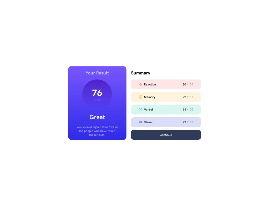
I see that you are using relative measurements, which is fine, I recommend you work with the first-mobile methodology, so you do the design first on mobile and then adapt it to desktop, which I think is what you need, a media store. and everything would be fine. Regarding the irsulo, I did it this way:

.circle {
    width: calc(7em + 5vmin);
    height: calc(7em + 5vmin);
    border-radius: 50%;
    display: flex;
    flex-direction: column;
    align-items: center;
    justify-content: center;
    background-color: var(--Light-royal-blue);
  }

So try to make the design for mobile first and then you can implement @media (min-width: 768px) or endpoint you want.

I hope my contribution is useful, if you have any other questions let me know.

Marked as helpful

1
P
Juan 90

@NavaMegalos

Posted

Hello!, perhaps they're out there someone with more expertise in responsive designs but I'd suggest to u that u search for a mobile first approach and also how to use media queries in ur css styles, it'll be very useful, after that u will see that u can adapt the circle and the other stuff to a certain resolution's, so... keep growing!

1

@timilehin223

Posted

@juannava67 I did the mobile design first and ran into a similar problem, so I did the desktop design first. I have the two as separate CSS files.

0
Ibhassan01 170

@Ibhassan01

Posted

Mobile first is the best approach, when you are done with mobile view, inspect your page with the dev tools in your browser and try increasing the width little by little, anywhere you notice that the contents get too small or doesn't look too good, create a media query for that width (Might be higher tho) @timilehin223

1

Please log in to post a comment

Log in with GitHub
Discord logo

Join our Discord community

Join thousands of Frontend Mentor community members taking the challenges, sharing resources, helping each other, and chatting about all things front-end!

Join our Discord