Results summary challenge using HTML and CSS

Solution retrospective
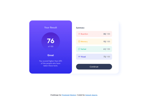
The part that makes this challenge so difficult is the proportion of the sizes, because I kind of what to copy the sample display in pixel perfect but doesn't end up that way. I am displeased when I have to use padding and margins too much just to make the spacing and the alignments to fits to my liking visually.
I used media queries for the first time (recommended by the advice and tips on my QR code challenge) but it is still quite difficult for me to utilize it. I need more practice on responsiveness.
Any tips or alternatives on the part where I used negative margin on the "Summary section" just to make it look like it is under the "Result Section" (I know it is not the best solution to do it)? I tried to do some research by my own but there are so many techniques that makes it difficult to choose. Thank you for the response!
And additional, I used <li> on the "Summary section" and make the display: inline-block. And the score as you can see, I can't make it place to the far right. I want to edit this as soon as I find the best solution. I spent like two hours, and still didn't find any thing that works.
Please log in to post a comment
Log in with GitHubCommunity feedback
No feedback yet. Be the first to give feedback on Jemuel Anacio's solution.
Join our Discord community
Join thousands of Frontend Mentor community members taking the challenges, sharing resources, helping each other, and chatting about all things front-end!
Join our Discord