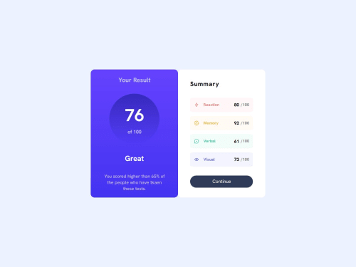
Results Summary Component

Solution retrospective
I'm proud that I was able to structure the project using React components effectively and learned how to pass props (including images and class names) between components. I also used CSS techniques like aspect-ratio and flexbox to style dynamic content, which made the layout more responsive.
If I were to do this project again, I would plan the layout more carefully before coding, especially around spacing and alignment. Some styling issues took more time than expected because I didn't fully account for how CSS behaves in nested flex containers.
What challenges did you encounter, and how did you overcome them?One major challenge was getting the layout spacing (gap) and circular shape (border-radius: 50%) to work properly. I learned that some CSS properties (like aspect-ratio) only work well when the parent container allows flexible height, and that gap only applies when display: flex or display: grid is used.
I overcame these issues by reviewing the parent container styles and adjusting the layout to support height expansion. I also broke components into smaller parts, which helped isolate bugs and made the code easier to maintain.
What specific areas of your project would you like help with?I'd like feedback on the following:
Am I using props in the most efficient and clean way, especially for passing styling classes and images?
Is my component structure clean and reusable, or should I restructure anything?
In terms of CSS: Are there better ways to manage layout spacing between elements (especially vertically), and how can I prevent layout issues like misaligned or non-scaling elements?
Please log in to post a comment
Log in with GitHubCommunity feedback
No feedback yet. Be the first to give feedback on Bunchydo's solution.
Join our Discord community
Join thousands of Frontend Mentor community members taking the challenges, sharing resources, helping each other, and chatting about all things front-end!
Join our Discord