Not Found
Not Found
Not Found
Not Found
Not Found
Not Found
Not Found
Not Found
Not Found
Not Found
Not Found
Not Found
Not Found
Not Found
Not Found
Not Found
Not Found
Not Found
Not Found
Not Found

Submitted

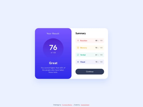
RESULTS SUMMARY COMPONENT 🎯 [ ACCESSIBLE - BEM - VANILLA CSS3 ]

#accessibility#bem#lighthouse
Abdul Khalid πŸš€β€’ 72,100

@0xabdulkhalid

Desktop design screenshot for the Results summary component coding challenge

This is a solution for...

  • HTML
  • CSS
1newbie
View challenge

Design comparison


SolutionDesign

Solution retrospective


πŸ‘Ύ Hello, Frontend Mentor Community,

This is my solution for the Results Summary Component.

  • Scored 98.3% on Google Pagespeed Insights! 🀩
  • Minified the css files to improve site performance πŸš€
  • Used Prettier code formatter to ensure unified code format βš™οΈ
  • Layout was built responsive via mobile first workflow approach πŸ“²
  • Had a lots of fun while building this challenge ! 🀠
  • Feel free to leave any feedback and help me to improve my solution πŸ’‘

Thoughts :

  • I'm not good in terms of using gradients in css, so that i can't match the gradient as same per the design. I don't have figma file to figure out the right gradient mixin (want to purchase premium account for that)
  • PS: This solution meant to be submitted 2 days ago πŸ₯², I'm back also so you can expect more solutions from me!

.

πŸ‘¨β€πŸ”¬ Follow me in my journey to finish all newbie challenges to explore solutions with custom features and tweaks

Ill be happy to hear any feedback and advice !

Community feedback

P
Jairo Valderramaβ€’ 420

@jairovg

Posted

Hi @0xAbdulKhalid, congrats on your solution; here are some comments that might help you to improve it:

  • You defined a really nice semantic component, I like it.
  • As a suggestion for your next solutions, push not only your minified files, so people can give you feedback on some other practices or process you're using, like your commitizen config, even the prettier or linters setup you may be using.
  • Around BEM, sr-only might have a better scope if treated as a modifier, instead of a block, like main--sr-only, which is totally valid, or even as an independent or utility class: sr-only.
  • You can create more granulated components, not only main, so you may avoid complex names like main__summary-xxx, and instead, have summary__xxx.
  • Meta keywords are no longer important from the SEO standpoint; they had been abused so much that they are irrelevant from many years ago. You can read more about it in this blog post or in this one.
  • Using colour variables linked to colour names, like red or yellow may take you to unnecessary refactors if the colour changes; instead, try to use variables scoped to features or categories using tokens.
  • There are 9 serious accessibility issues, all regarding colour contrast, here is one of them:
Ensures the contrast between foreground and background colors meets WCAG 2 AA minimum contrast ratio thresholds
To solve this problem, you need to fix the following:
Element has insufficient color contrast of 2.9 (foreground color: #ff5757, background color: #fff5f5, font size: 13.2pt (17.6px), font weight: bold). Expected contrast ratio of 4.5:1

Related Nodes
<li class="main__summary-topic" style="background-color: hsla(0, 100%, 67.1%, 0.06)">

I hope you find it useful. I'm happy to take another look at your solution if you make some other changes.

Marked as helpful

0

Abdul Khalid πŸš€β€’ 72,100

@0xabdulkhalid

Posted

Glad to receive valuable feedback from you @jairovg!

  • Regarding the minified css file, currently i'm on rush in completing the challenges faster and cleaner as much as possible. I will not leave any comments in html or css. So that i minified those assets
  • The statement regarding the BEM Naming convention makes more sense than mine also
  • The meta for SEO is needed for scoring in Pagespeed Insights, and i'm constantly ensure to score the best (cuz it's needed)
  • I never heard about token thanks for sharing along with a resource
  • And finally the color contrast, Yeah i also know about the issues cuz it's drastically damages the accessibility. But these color are given on the challenge itself.
  • Not for only this challenge, every challenge consists of color patterns with bad standards, I will make sure to post another solution for each challenge where i will change the colors to improve accessibility though.

.

Thank you once again for sharing your thoughts!

0

Please log in to post a comment

Log in with GitHub
Discord logo

Join our Discord community

Join thousands of Frontend Mentor community members taking the challenges, sharing resources, helping each other, and chatting about all things front-end!

Join our Discord