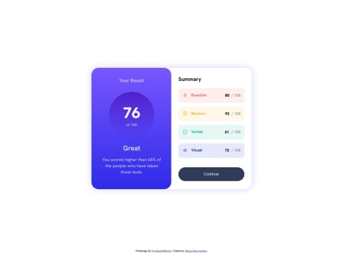
Results summary component challenge

Solution retrospective
I am unsure with the amount of div in my html code. I wonder if everything is correct there.
Please log in to post a comment
Log in with GitHubCommunity feedback
- @VladMishchuk
/* Для моб. пристроїв */ .summary {} витерти max-width: 317px; /* на планшетах через ліміт по ширині ця частина "відривається" від правого краю */ /* Для ПК */ .summary, total_score { flex: 1; /* цікава річ) допомагає в ситуаціях коли треба зроби рівні по ширині/висоті флекс-елементи */ } .summary { margin: 30px; /* на око кинув щоб "Summary" правої сторони вирівнявся з "Your Result" */ } .wrapper { min-width: 42rem; /* теж на око кинув) це щоб картки з оцінками не складались вдвоє */ } витерти width: 737px; height: 510px; .summary__points__wrapper { margin-left: auto; /* щоб притиснути оцінку до правого краю */ } .summary__points__red, .summary__points__yello, .summary__points__green, .summary__points__blue { gap: 1rem; /* для відступу між іконкою і назвою показника */ } витерти justify-content: space-around; /* більше не потрібен */ .summary__points__reaction, .summary__points__memory, .summary__points__verbal, .summary__points__visual {} витерти padding-right: 100px; /* якщо не забрати то при звуженню екрану то картки з оцінками складатимуться вдвоє */ button { padding: 20px 0; width: 100%; /* щоб кнопка поводила себе як div тег - займала всю ширину */ }
Надіюсь буде корисним. І щоб жилося легше - коли помітиш що у групи елементів виходять однакові css властивості:
a, b, c { margin: 0; padding: 0; } a { color: black; margin: 1px; /* можна переназначити потім */ } b { color: red; }
Marked as helpful - @nibess1
perhaps you could use an unordered list, and set the colors using n-th child in CSS for the Summary Page
Marked as helpful
Join our Discord community
Join thousands of Frontend Mentor community members taking the challenges, sharing resources, helping each other, and chatting about all things front-end!
Join our Discord