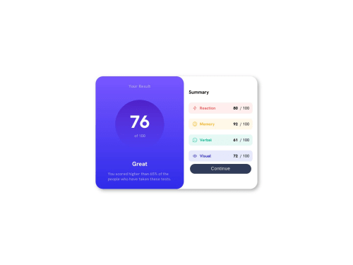
Submitted about 2 years agoA solution to the Results summary component challenge
Results Summary Component

@ctrl-brokencode
Solution retrospective
Hello! This is my solution to this challenge. I really appreciate if you take your time to help me and give opinions on my code. I hope you're having a great day/afternoon/evening!
Code
Please log in to post a comment
Log in with GitHubCommunity feedback
- @CGM-ThanHtike
Hello @Gabriel-H502 I reviewed ur code and here's my suggestions
- It's a good practice to put your style.css at the lowest level in head tag bcoz u might have conflict in future like when u use bootstrap etc.
- using fixed width is not good for responsive.
- don't use !important like these, unless it's really necessary, it can cause unnecessary problems in large projects as far as I concerned.
width: 200px !important;height: 200px !important;margin: 30px !important; - using rem on font-size is a better approach I think, I'm recommend to read this article for more info about rem and em. The Surprising Truth About Pixels and Accessibility
- And for the design approach, you should make those spacing same as design file (ur card looks short bcoz of lacking space)
- As you use display flex on your .results container, you can use gap property in it, (put like gap: 20px) and it looks much better.
- Last but not least, instead of using margins to center ur card (as it's not good for responsive), use these instead
- in ur body tag
display: grid;place-content: center;min-height: 100vh;
I hope these tips might help
Marked as helpful

Join our Discord community
Join thousands of Frontend Mentor community members taking the challenges, sharing resources, helping each other, and chatting about all things front-end!
Join our Discord