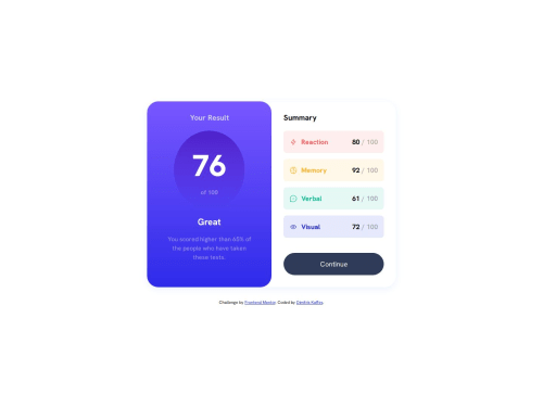
Submitted 7 months agoA solution to the Results summary component challenge
Results summary component | mobile first and simple Grid usage

@dkaffes
Solution retrospective
What are you most proud of, and what would you do differently next time?
- The HTML code uses semantic elements and its structure is getting better.
- The CSS code is better organized and easier to read compared to previous challenges.
- The implementation of Andy Bell's CSS Reset introduced some issues with margins. I had to remove margins (
margin-inlineforbodyandmargin-block-startfor various elements) using extra classes. - I had issues standardizing the behavior of the circular container containing the text: "76 out of 100". A trial and error procedure resulted in the usage of the following code (mobile):
.result-score-container {
  width: 50%;
  height: auto;
  margin: auto;
  border-radius: 50%;
  padding: 1rem;
}
However, in small mobile widths (eg 300px) the circle becomes egg-shaped. For the desktop version the code changed as follows:
  .result-score-container {
    width: 80%;
    padding: 2rem;
  }
- Is the way I implemented the circular container containing the text: "76 out of 100" correct?
- Is there a better solution to make it more robust and responsive?
- Any help will be truly appreciated!
Code
Loading...
Please log in to post a comment
Log in with GitHubCommunity feedback
No feedback yet. Be the first to give feedback on dkaffes's solution.
Join our Discord community
Join thousands of Frontend Mentor community members taking the challenges, sharing resources, helping each other, and chatting about all things front-end!
Join our Discord