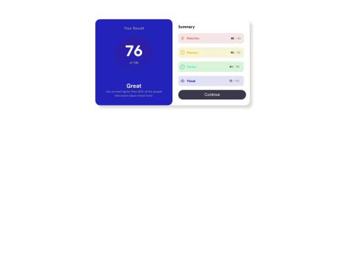
Results summary component - responsive layout with grid and flex

Solution retrospective
I have a little problem with my button responsiveness. With padding I set it's size for mobile and desktop separately and issues emerges in the middle. The button is too small when the screen is between the smallest size for this challenge - 375px and the breaking point - 450px. I fixed this setting padding in % instead of px. Is there any other good option to make button responsive?
I also wonder why projects on my screenshot is visibly smaller than that from original. I tried to make it relatively big to much the original. Does someone knew why it is like this? Is it only a matter of size of components on my project or something else?
Please log in to post a comment
Log in with GitHubCommunity feedback
No feedback yet. Be the first to give feedback on Arkadiusz's solution.
Join our Discord community
Join thousands of Frontend Mentor community members taking the challenges, sharing resources, helping each other, and chatting about all things front-end!
Join our Discord