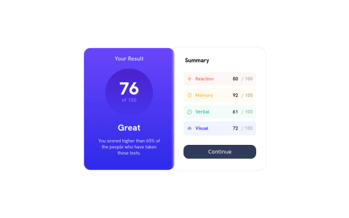
Results summary component

Please log in to post a comment
Log in with GitHubCommunity feedback
- @elioflo
Hi, I think your solution looks great! My suggestion would be to focus on approaching the design rather than making it identical. I remember when I started out, I found it very difficult to make my designs look exactly the same as the reference. Instead, it's better to concentrate on improving your HTML and CSS skills, so that you can better understand how to implement your design. At the end of the day, it's mainly about getting the sizes and proportions right. So, don't get too caught up on making the design perfect.
You can use dev tools to help you approach the design, and if your project looks similar to the design, that's good enough. What I like to do is measure the sizes and proportions and try to replicate them as closely as possible.
I hope this advice is helpful to you!
Elio Flores
Marked as helpful

Join our Discord community
Join thousands of Frontend Mentor community members taking the challenges, sharing resources, helping each other, and chatting about all things front-end!
Join our Discord