


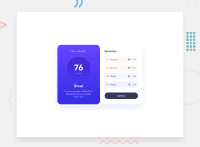
Design comparison

Solution retrospective
Hello!
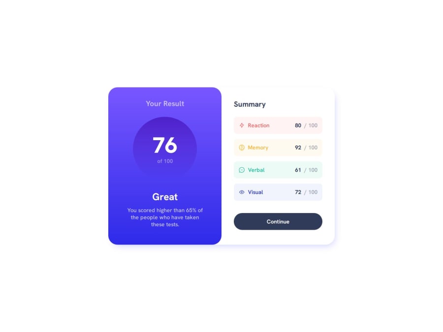
I build this results component starting with a mobile-first approach. It is one of the best strategies to create either a responsive or adaptive design. Started with the smallest mobile screen and worked my way up.
To make my component more accessible I used :focus-visible pseudo-class to increase usability for sighted users who use keyboard navigation. The :focus-visible pseudo-class is a native CSS way to style elements that are in focus but only applies when you actually want a visual indicator to help the user see where the focus is. Read more about :focus-visible
Learned and implemented Modern CSS reset. The goal of a reset stylesheet is to reduce browser inconsistencies in things like default line heights, margins and font sizes of headings, and so on. Modern CSS reset by Andy Bell
This is another project in which I used the BEM (Block, Element, Modifier) methodology, which is a popular naming convention for classes in HTML and CSS. You can read more about that in my previous challenges. You can learn more about BEM here.
No specific questions here, but any suggestions on how I can improve are welcome!
Community feedback
Please log in to post a comment
Log in with GitHub
Join our Discord community
Join thousands of Frontend Mentor community members taking the challenges, sharing resources, helping each other, and chatting about all things front-end!
Join our Discord