


@CoconutDev13
Posted
Hello, nice try and there are few easy adjustments you could do to make it way more good than it is.
First of all you need to have a concern that websites by default are 100% responsive( or almost 100% ). No overflows, no imbalanced containers, everything works fine. When you add some constant width or height or both in order to make the page look a little bit nicer you need to have in your mind "what would happen if I resize that page" or "what would happen if I add one sentence a little bit bigger in the same component"?
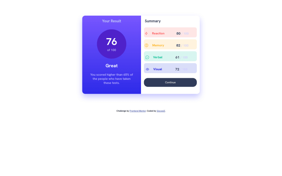
So lets analyze your summary component:
<div class="summary-contents bg1">
  <div class="summary-contents">
    <img src="./assets/images/icon-reaction.svg" alt="rection" loading="lazy">
    <h4 class="summary-text1">Reaction</h4>
  </div>
  <div>
    <p><span class="summary-value">80</span> / 100</p>
  </div>
</div>
First major problem here is that you have same class summary-contents on your wrapper div and div that contains icon and title. When you add some padding to that class your left side of this component would take twice that padding and the right side would take it once. That would end up having your contents a little bit shifted to right side of your component.
Also I see that you use space-evenly to align items. That would lead to some issues as well because it will automatically calculate space on the left and right of component because contents are different widths and you won't be able to control that space with padding.
So I suggest you to use space-between instead.
Give it a try, and let me know if that works
Marked as helpful
@SixcoolZ
Posted
@CoconutDev13 Thanks for helping out. I got to learn a lot from your help and I made the changes you said and it worked perfectly well. I also made an adjustment in my css in the class container. I noticed using text-align: center, it really affected the both side. I've pushed the changes I made. Thanks for the help once again. I really appreciate.
