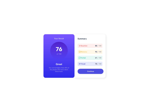
Skip to content
  • Unlock Pro
  • Log in with GitHub
Solution
Submitted almost 2 years ago

Results Summary Component (With Responsive Design)- Jordan Kleinbaum

Jordan Kleinbaum•210
@JordanKleinbaum
A solution to the Results summary component challenge
View live sitePreview (opens in new tab)View codeCode (opens in new tab)

Solution retrospective


❗Question: If you look closely at the photo of how it's meant to look, the blue rectangle has rounded corners and is on top of the white rectangle with no rounded corners. I tried that, but I couldn't get them to overlap. How would I do that?

Thank you!

Code
Couldn’t fetch repository

Please log in to post a comment

Log in with GitHub

Community feedback

  • Yefree Valdez•940
    @yefreescoding
    Posted almost 2 years ago

    You did an awesome job with this solution! It looks almost spot on compared to the original design. To answer your question, I'll share how I did it, along with some tips on writing cleaner, more semantic, and organized code.

    • ⚠️Always remember to use semantic tags in your HTML file. Tags like header, main, footer, section, aside... Check out this link for more details on why they're important!.

    To address your doubt regarding the "[...], the blue rectangle has rounded corners and is on top of the white rectangle with no rounded corners. [...]". I believe this solution would work without altering your HTML file. Simply assign a background color to the parent component, which, in your case, is this one <div class="everything">

    .everything{
      background-color: white; //Or any color you want
      // The rest of your styles go here.
    }
    // Is not necessary to give a background color to the right half of the component
    .right-half {
      background-color: transparent;
    }
    

    I did check your code, and test this solution on my browser with the developer tools. It fixes the problem 🥳

    Additionally, I'd like to provide some corrections and offer you advice on how to improve your solution.

    • First you should use a container to wrap all your content. And then your component would be the section inside of this container.
    <main class="wrapper">
      <div class="everything">
        <section class="left-half">
          // Your context goes here
        </section>
        <section class="right-half">
          // Your context goes here
        </section>
      </div>
    </main>
    
    • A <h1> is a must have in every web page. important❗️ Just one per page.
    // Change this p for a h1
    ❌
    <p class="your">Your Result</p>
    ✅
    <h1 class="your">Your Result</h1>
    
    • As a said before, we should only use <div>, when there's no other option. A good practice will be something like this.
    <section class="lefthalf">
      <header class="topPart">
        <h1 class="your">Your Result</h1>
      </header>
      <article class="middlePart">
        <h2 class="rating">76</h2>
        <p class="of">of 100</p>
      </article>
      <article class="bottomPart">
        <h2 class="great">Great</h2>
        <p class="you-scored">
          You scored higher than 65% of the people who have taken these tests.
        </p>
      </article>
    </section>
    

    These are just some pieces of advice for good practices, writing cleaner, more semantic, and better-structured code. Following these tips will help you debug faster and become a valuable part of the team. Additionally, it will make your websites more accessible and improve their SEO. Overall, you're doing great! Congratulations! I hope the tips I've shared here will help you become an even better developer.

    Extra tips:

    • Introduction to Flexbox
    • Introduction to Grid
    • The Odin Project
    Marked as helpful
  • Luis Jimenez•760
    @LuisJimenez19
    Posted almost 2 years ago

    Hi, congratulations for finishing the challenge.

    Regarding your question, to achieve the desired effect, you should wrap both sides in a main container, although I see that you are using the everything layer, this layer is the one that should give the white background, that will give the desired effect. Another suggestion is that it is always better to manipulate the content in the container, example:

    body{
         min-height:100vh;
         width:100%;
         display:flex;
         justify-content:center;
         align-items:center;
    }
    

    With this you can center the entire card without having to play with the positioning. And in this main everything container you can also apply a flex and a max-width:740px or the width you want, then each part of the card will occupy half and you don't have to specify it in each one. if it doesn't work add the rule flex-grow:1; this will make each part occupy the same size.

    I hope my contribution is helpful.

    Marked as helpful
  • Ali Ali•40
    @alibeniaminali
    Posted almost 2 years ago

    Hi Jordan,

    Well done on the solution! Looks great!

    Regarding your question. As far as I can see the box-shadow is on the Summary (the one with class="righthalf"), instead try to put the box-shadow on the whole component (the one with class="everything"). That should fix the whole thing for you.

    Let me know if that was helpful.

    Kind regards, Ali

Join our Discord community

Join thousands of Frontend Mentor community members taking the challenges, sharing resources, helping each other, and chatting about all things front-end!

Join our Discord
Frontend Mentor logo

Stay up to datewith new challenges, featured solutions, selected articles, and our latest news

Frontend Mentor

  • Unlock Pro
  • Contact us
  • FAQs
  • Become a partner

Explore

  • Learning paths
  • Challenges
  • Solutions
  • Articles

Community

  • Discord
  • Guidelines

For companies

  • Hire developers
  • Train developers
© Frontend Mentor 2019 - 2025
  • Terms
  • Cookie Policy
  • Privacy Policy
  • License

Oops! 😬

You need to be logged in before you can do that.

Log in with GitHub

Oops! 😬

You need to be logged in before you can do that.

Log in with GitHub

How does the accessibility report work?

When a solution is submitted, we use axe-core to run an automated audit of your code.

This picks out common accessibility issues like not using semantic HTML and not having proper heading hierarchies, among others.

This automated audit is fairly surface level, so we encourage to you review the project and code in more detail with accessibility best practices in mind.

How does the CSS report work?

When a solution is submitted, we use stylelint to run an automated check on the CSS code.

We've added some of our own linting rules based on recommended best practices. These rules are prefixed with frontend-mentor/ which you'll see at the top of each issue in the report.

The report will audit 1st-party linked stylesheets, and styles within <style> tags.

How does the HTML validation report work?

When a solution is submitted, we use html-validate to run an automated check on the HTML code.

The report picks out common HTML issues such as not using headings within section elements and incorrect nesting of elements, among others.

Note that the report can pick up “invalid” attributes, which some frameworks automatically add to the HTML. These attributes are crucial for how the frameworks function, although they’re technically not valid HTML. As such, some projects can show up with many HTML validation errors, which are benign and are a necessary part of the framework.

Oops! 😬

You need to be logged in before you can do that.

Log in with GitHub

Oops! 😬

You need to be logged in before you can do that.

Log in with GitHub

Oops! 😬

You need to be logged in before you can do that.

Log in with GitHub