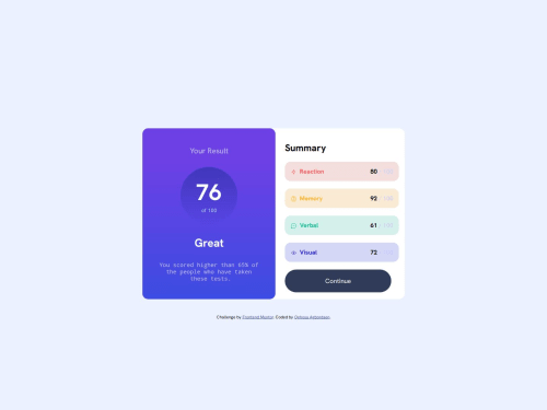
Submitted 9 months agoA solution to the Results summary component challenge
Results Summary Webpage using Html and Css

@OghosaAgbontaen
Solution retrospective
What are you most proud of, and what would you do differently next time?
I would definitely make it more responsive.
What challenges did you encounter, and how did you overcome them?I had issues making it responsive.
What specific areas of your project would you like help with?I tried to make it responsive for different devices, I did it but whenever I inspect again, it stops being responsive.
Code
Loading...
Please log in to post a comment
Log in with GitHubCommunity feedback
No feedback yet. Be the first to give feedback on OGHOSA AGBONTAEN's solution.
Join our Discord community
Join thousands of Frontend Mentor community members taking the challenges, sharing resources, helping each other, and chatting about all things front-end!
Join our Discord