Not Found
Not Found
Not Found
Not Found
Not Found
Not Found
Not Found
Not Found
Not Found
Not Found
Not Found
Not Found
Not Found
Not Found
Not Found
Not Found
Not Found
Not Found
Not Found
Not Found

Submitted

Rock, Paper, Scissors, (Lizard, Spock) game with SCSS, Vanilla JS

#accessibility#sass/scss

@K4UNG

Desktop design screenshot for the Rock, Paper, Scissors game coding challenge

This is a solution for...

  • HTML
  • CSS
  • JS
4advanced
View challenge

Design comparison


SolutionDesign

Solution retrospective


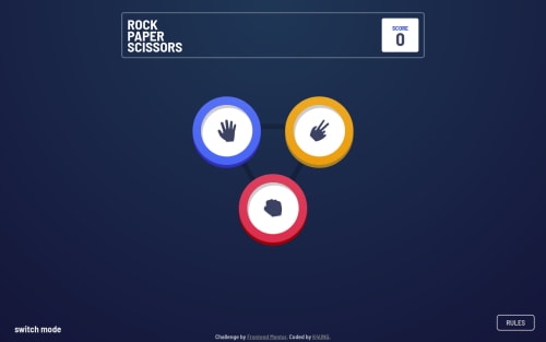
I tried to make this a single page app and because of that I almost didn't do the bonus challenge. But somehow I finished it. I tried to reuse as many code as possible and overall, I'm really satisfied with how it turned out.

I learned a lot about JS and familiarized myself with timing functions. The hard part for me was fitting everything in one file and reusing them. I also added some sound effects and hopefully it doesn't annoy you. I'd very much love to hear your feedbacks and suggestions on how I can improve further. Happy Coding!

P.S. I had my overflow: hidden on my body before, that's why the preview screenshot looks messed up. I fixed it by putting it all in a wrapper and it should be fine now.

Community feedback

@MojtabaMosavi

Posted

Hi Kaung!, Congrats on completing this, it's not a easy beast to sly. I think the the sound effects a positively supplemental to the interactivity, it's always fun and inspirational to see individuals mark up the interactivity (pun intended) and get creative.

  • Using ES6 module system you can easily split this into sperate chunks by functionality something like:
game:
    modal.js
    rockPaperScissors.js
    rockPaperScissors-extended.js
    main.js 
  • The close icon in the modal has a simple hover state where the bg color is changed to red.

  • Upon tabbin the game button excute the styles of the hover state, it would be benefiery to visual user if the aslo had some kind of visual marker like a ouline:

game-button{

    &:hover,&:focus{
        outline: 1px solid color;
        outline-offset: 0.25rem; 

} 
}
  • A note about you implentation of the mode, using a unordered list has accessibility implication such as a screen reader would take much longer time to read all the five list item reather tha a simple heading one therefore the mode is semantically better descriebed be a <h1>.

  • The pluse animation is key visual, suggetively it should be amplified.

Keep coding :=)

Marked as helpful

1

@K4UNG

Posted

@MojtabaMosavi Hey Mojataba! Thanks a lot for you feedback. Happy to hear that you liked the sound effects. I didn't know about the module system as I'm relatively new to JS. Will definitely check it out. For the buttons, I actually removed the outlines intentionally but I'll increase the size to make it more noticeable. I'll also work on the ul of the mode. Thanks a lot and Happy Coding!

0

Please log in to post a comment

Log in with GitHub
Discord logo

Join our Discord community

Join thousands of Frontend Mentor community members taking the challenges, sharing resources, helping each other, and chatting about all things front-end!

Join our Discord