Room Home Page Master

Solution retrospective
I'm most proud of successfully implementing a responsive and visually appealing design that closely matches the reference. The interactive slider and structured layout enhance the user experience, making the project both functional and aesthetically pleasing.
If I were to do it differently next time, I would focus more on optimizing the code by using CSS Grid for better alignment, ensuring perfect responsiveness across all screen sizes, and possibly adding smooth transitions for a more polished feel. Additionally, I would refine the image placements further to achieve pixel-perfect accuracy.
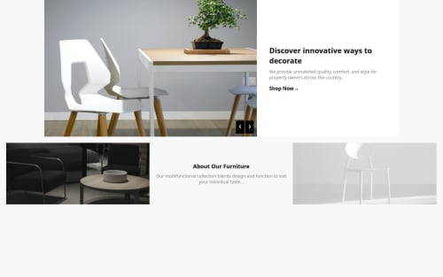
What challenges did you encounter, and how did you overcome them?One of the main challenges I encountered was ensuring that the images and text were perfectly aligned to match the reference design. The chairs in the hero section were slightly misaligned, making the layout look inconsistent.
To overcome this, I adjusted the CSS properties, specifically using object-fit: cover; and fine-tuning the widths and heights to maintain uniformity. Additionally, I used flexbox strategically to ensure the layout remained structured and responsive across different screen sizes.
Another challenge was implementing the slider functionality smoothly. I solved this by organizing the image data in an array and using JavaScript to update the content dynamically, making navigation seamless.
What specific areas of your project would you like help with?I would like help with ensuring pixel-perfect alignment of the images, especially the chairs in the hero section, so they align perfectly with the white content box. Additionally, I want to refine the responsiveness to ensure the layout adapts well across different screen sizes without misalignment.
If there’s a more efficient way to structure the CSS or improve the JavaScript slider functionality for smoother transitions, I would appreciate guidance on that as well.
Please log in to post a comment
Log in with GitHubCommunity feedback
No feedback yet. Be the first to give feedback on NayyabAqib's solution.
Join our Discord community
Join thousands of Frontend Mentor community members taking the challenges, sharing resources, helping each other, and chatting about all things front-end!
Join our Discord