


@pikapikamart
Posted
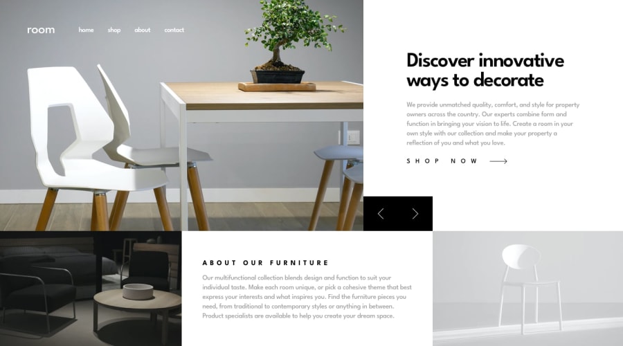
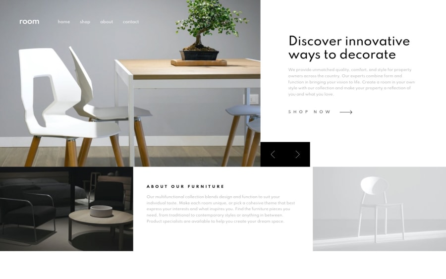
Hey, good work on this one. The desktop layout is really good and the slider functions very well.
Though I think that you breakpoint is too early. You started it around 1200px which I think is for desktop layout. So by doing that, you could see that the images are so large since every image, you declared them to take full width and full height of the container.
The text also in the second section doesn't really blend that well in the background. Since the background-image is somewhat dark, you are using a dark colored text which is not being contrasted well enough. Using a lighter color will be really great so that it will be more readable.
The last image on the mobile state, takes really big portion of the screen and because of it, the image is now blurred which is not ideal. Changing those sizes will be really good.
But still good work on this one and changing those mentioned will be really awesome^
@MishaHernandez
Posted
@pikamart Thank you very much for your time, I am taking note of your feedback to improve the design ✌
