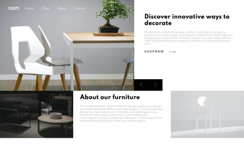
Submitted over 4 years agoA solution to the Room homepage challenge
Room hompage slideshow with html, css and JS

@Phrukey
Solution retrospective
Any feedback will be greatly appreciated.
Code
Please log in to post a comment
Log in with GitHubCommunity feedback
- @DestinyIJ
This is entirely my opinion.
I think the right/left button is unnecessary and does not provide a good aesthetics. You can try to animate the message instead of one having to click on the button. Better still, place the blocks below one another.

Join our Discord community
Join thousands of Frontend Mentor community members taking the challenges, sharing resources, helping each other, and chatting about all things front-end!
Join our Discord