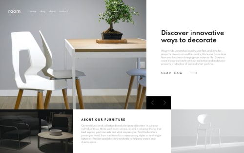
Submitted over 4 years agoA solution to the Room homepage challenge
Sass and CSS grid for first time

@dimolf345
Code
Please log in to post a comment
Log in with GitHubCommunity feedback
- @grace-snow
Hi
A few suggestions for you, I hope these are helpful 🙂
- logo can't be a H3. I'd have that as a word inside a link like other nav items (and it's generally established clicking the logo will take you 'home'
- Make sure you've got visible focus states on all interactive elements, including slider links
- The design breaks at mid sized screens. Some of this is down to really poor design on this particular challenge though (readability of the desktop menu over an image is terrible! 😆)
- Shop now would be an anchor tag, not button (it's navigation, not action)
- I'm not sure how search engines would react to having multiple h1s in a page, but that's a common issue with sliders/carousels. Again, the design's fault really. Just raising as it's the kind of thing you'd want to talk through with a designer and marketing team if on a real project.
- About our furniture title should be a h2. Headings must always go in order
- Same section, that heading is touching the section above for me. Looks like it needs some vertical padding as well as horizontal?
- Similarly, give text-container some larger bottom padding on desktop to make sure the shop now button doesn't touch the slider controls
- The mobile nav toggle needs to be a button, not a div, and have a label readable by assistive technology (e.g. aria-label)
Good luck. there's a lot of work in this one and it's not easy!

Join our Discord community
Join thousands of Frontend Mentor community members taking the challenges, sharing resources, helping each other, and chatting about all things front-end!
Join our Discord