


Raymart Pamplona• 16,140
@pikapikamart
Posted
Hey, great work on this one. The layout both desktop and mobile is really good and the responsiveness is really great. This is a really good looking layout.
Some suggestions would be:
- The website logo link in the
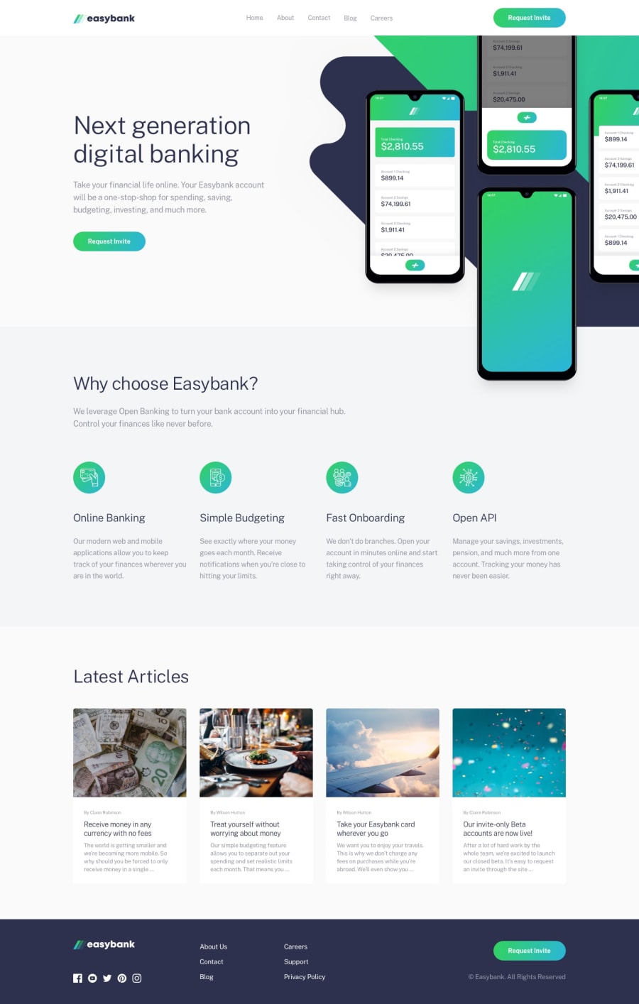
headeris much better not being inside thenavelement, having it's own wrapper. The reason is that,navshould contain those links that will take user in different webpages right since it is navigation links, also, you may think, " the company link is a link to the homepage, why it is not included as well", usually in anavelement, links are insideulelement, this is because you want the user to be informed how many links inside it since screen readers tells users how many items are there in a list. If you included the website logo link in there, a user will be confused especially when they are using your website in a phone. Since navigation links are sometimes used in the dropdown, when they navigate in there, ( talking about your current structure) the screen reader will already say that the website log link is the navigation links, and when they go through the dropdown links, the screen reader won't notify them that those are navigation links, since it already said it at the beginning. So sorry if I may have confused you about my explanation. But you can look in frontendmentorheaderyou will see how it should be structured. - Website logo link in the
headershould havearia-label="homepage", so that users will know where this link would take them. - The five links in the
headershould be insidenavthat is inside aul. - Always have a
mainelement. This guides a user to properly navigate your website. The structure should be:
<header />
<main />
<footer />
- If an
imgdoes not add any content, usealt="". Do not leave it like that, use emptyalt="". - The four title on the
why choose easybankshould use heading tags, since those are topics that are inside thewhy choose easybanksection. Better notify a user why they would choose it. - The four articles could use an
articleelement, wrapping it whole:
<a>
  <article>
    { content is here }
  </article>

</a>
- The article titles should use heading tag.
FOOTER
- Website logo link
atag should use `aria-label="homepage". - Website logo
imgshould usealt="easybank". - Social media links should be inside
ulsince those are list of social media links. Eachatag as well should have usedaria-label. For example, theatag that wraps the facebook should usealt="facebook". - The six links should be inside a
ulelement, that is inside anavelement.
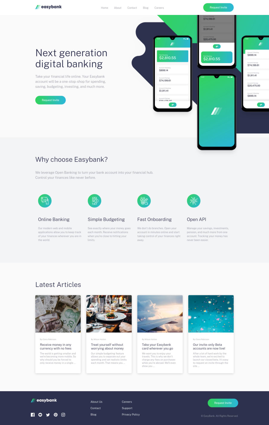
MOBILE
- The hamburger menu should use a
buttonand notatag, since it is not a link, it is a control andbuttonare used for those. - The hamburger button should also have
aria-label="hamburger dropdown toggler"so that users will know what thisbuttonwill do. It also should havearia-expandedthat is being changed by javascript. This will notify a user if a dropdown has been expanded, you can search the usage of that in google.
Aside from those, really great work on this.
Marked as helpful
0

