Sass and js

Solution retrospective
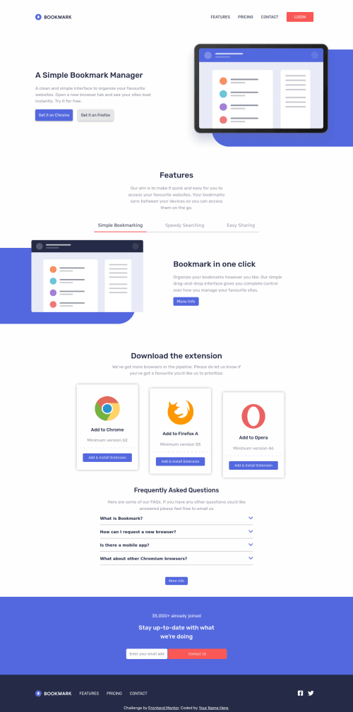
I've tried to make it as accessible as possible, but I'm a bit worried I've ended up using too many buttons. I ended up using buttons for the the tabs, and for the frequently asked questions. I wasn't sure if this was the best way to do it.
Any feedback will be appreciated, thank you.
Please log in to post a comment
Log in with GitHubCommunity feedback
- @Dharmik48
Hey👋,
Your solution is really well done! It's Very Good! Just a minor issue I'd point out is:
- In the contact section, when I hover the contact us button, the height of the footer just increases by a bit because of the border on the button during hover (as there's no border in normal state).
Apart from it the solution is very nice, keep it up👍.
Marked as helpful
Join our Discord community
Join thousands of Frontend Mentor community members taking the challenges, sharing resources, helping each other, and chatting about all things front-end!
Join our Discord