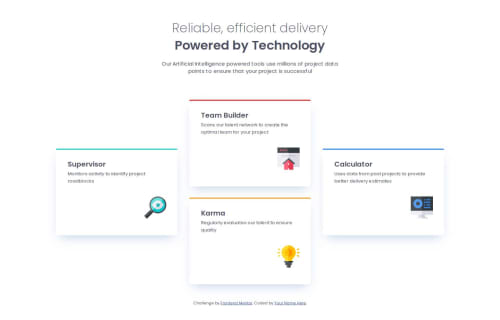
SASS, Mobile First Four Card Feature

Solution retrospective
This was good practice for working with Grid CSS, I also used custom data attributes for the card titles so I could identify them more readily in my stylesheets. I try to use BEM naming for my css class names, which are sometimes too generic when trying to keep track of the different content of the four cards. This made customizing the card layout a lot easier because I could use the more human readable data-title as my CSS selector. This was helpful when managing the different styles between the phone, tablet and desktop breakpoints.
Grid has a lot of elements to it, I'm often times running to MDN or CSS-Tricks.com's Grid overview for clarification when something doesn't work the way I expect. One example of this was getting the top card to center itself on the page. I had set up a 10 column grid for tablet and a 12 column grid for desktop and positioned the individual cards using justify-content:center. I used grid-colum:... and grid-row:... to move the cards to diffent rows in the grid, but I found that the top card was never centered correctly. I eventually just set the top card to margin-inline: auto and that seemed to fix it.
I learned that Grid CSS still needs some tweaking to get elements positioned the way you want!
Please log in to post a comment
Log in with GitHubCommunity feedback
No feedback yet. Be the first to give feedback on Scott's solution.
Join our Discord community
Join thousands of Frontend Mentor community members taking the challenges, sharing resources, helping each other, and chatting about all things front-end!
Join our Discord