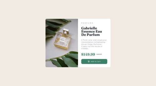
Not Found
Not Found
Not Found
Not Found
Not Found
Not Found
Not Found
Not Found
Not Found
Not Found
Not Found
Not Found
Not Found
Not Found
Not Found
Not Found
Not Found
Not Found
Not Found
Not Found

Submitted

Semantic HTML and CSS responsive product preview card component

@EJMK18

Desktop design screenshot for the Product preview card component coding challenge

This is a solution for...

  • HTML
  • CSS
1newbie
View challenge

Design comparison


SolutionDesign

Solution retrospective


What are you most proud of, and what would you do differently next time?

I am proud of the steady improvement I have been making. I completed this challenge within 01h30m.

I would focus on creating reusable CSS custom variables for layouts to improve on my project completion time.

What specific areas of your project would you like help with?

All feedback is welcomed.

Community feedback

@0xabdulkhalid

Posted

Hello there 👋. Congratulations on successfully completing the challenge! 🎉

  • I have a suggestion regarding your code that I believe will be of great interest to you.

PiCTURE TAG 📸:

  • Looks like you're currently using media queries for swapping different version of image,
<img src="images/image-product-desktop.jpg" alt="Image of the  Gabrielle Essence Eau De Parfum bottle" class="desktop-product-img">
<img src="images/image-product-mobile.jpg" alt="Image of the  Gabrielle Essence Eau De Parfum bottle" class="mob-product-img">
  • So let me introduce the picture element. It's commonly used for responsive images, where different image sources are provided for different screen sizes and devices, and for art direction, where different images are used for different contexts or layouts.
  • Example:
<picture>
  <source media="(max-width: 768px)" srcset="small-image.jpg">
  <source media="(min-width: 769px)" srcset="large-image.jpg">
  <img src="fallback-image.jpg" alt="Example image">
</picture>
  • In this example, the <picture> tag contains three child elements: two <source> elements and an <img> element. The <source> elements specifies different image sources and the conditions under which they should be used.
  • Using this approach allows you to provide different images for different screen sizes without relying on CSS, and it also helps to improve page load times by reducing the size of the images that are served to the user
  • If you have any questions or need further clarification, you can always check out my submission and/or feel free to reach out to me.

.

I hope you find this helpful 😄 Above all, the solution you submitted is great !

Happy coding!

Marked as helpful

0

Please log in to post a comment

Log in with GitHub
Discord logo

Join our Discord community

Join thousands of Frontend Mentor community members taking the challenges, sharing resources, helping each other, and chatting about all things front-end!

Join our Discord