Semantic HTML5, CSS Custom Properties, Mobile-first workflow

Solution retrospective
I’m most proud of how I implemented a fully responsive QR code component using semantic HTML5 and clean CSS. The design is simple but effective, and I made the layout adapt smoothly to both mobile and desktop devices. I’m also happy with the use of CSS custom properties, which made styling more efficient and easier to manage.
Next time, I would focus more on optimizing the layout for smaller screen sizes and explore the possibility of adding animations or transitions for visual enhancement. I would also experiment with more advanced CSS techniques, such as grid layouts, to improve design flexibility.
What challenges did you encounter, and how did you overcome them?One challenge I faced was ensuring the layout worked seamlessly across different screen sizes. At first, I had difficulty balancing the layout on very small screens without making the elements too cramped. I overcame this by using flexible widths and the mobile-first approach, where I started designing for mobile screens and then adjusted for larger screens using media queries.
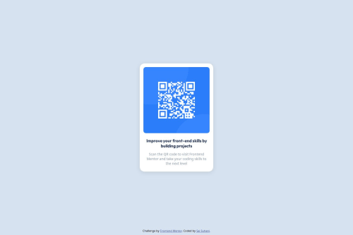
Another challenge was working with the QR code image to ensure it was scalable across different devices. To fix this, I used CSS to set the image width to 100% and ensured it looked good across various screen sizes.
What specific areas of your project would you like help with?I would love feedback on how to improve the responsiveness of the layout even further. Any suggestions for improving the visual design or adding subtle animations would also be great. Additionally, if anyone has advice on how to enhance performance while maintaining visual quality, that would be incredibly helpful.
Please log in to post a comment
Log in with GitHubCommunity feedback
- P@SabineEmden
Here are some suggestions how you can improve your solution. I hope they help. Let me know if you have any questions!
Responsive Design
This project doesn’t need any media queries. You can see in the Figma design file that the width of the component is 320 pixel in both the mobile and the desktop view. The design doesn’t shift.
- Remove the media queries from your code. You don’t need them here.
- Convert the width in the design file to
remand use that as themax-widthof the component. (See below for more onrem.) - Add some padding to the body, so the component doesn’t touch the edge of the screen on smaller screen sizes.
- Change the height of the
bodyelement fromheight: 100vhtomin-height: 100vh(or usesvh). This allows the height of thebodyto be larger than the height of the viewport if necessary, for example on a mobile device in landscape mode.
It’s great that you want to make you projects responsive. If you follow the learning paths on Frontend Mentor, you will get lots of opportunities to practice responsive design.
Just for future reference:
Let’s say a component had a width of 320 pixel on small screen sizes; on screens wider than 768 pixel, the width would change to 480 pixels. For mobile first design, you would write the CSS rules for the small screen sizes first, as you default, with no media query. You would then use a media query to add a breakpoint and change the width for wider screens.
/* This is how the component looks on mobile by default */
.component {
	max-width: 20rem;
}

/* This changes the layout for screens wider than 48rem */
@media (min-width: 48rem) {
	.component {
		max-width: 30rem;
	}
}
The media query has to be below the default styling in the style sheet, or it won’t work. And be careful to use
min-widthormax-widthin your media query, notwidth. You have@media (width: 1440px)in your code. That would work only at a width of exactly 1440 pixel.Semantic HTML and Web Accessibility
The main reason why we want to use semantic HTML is to make our web pages easier to navigate for people who use assistive technology like screen readers. For this, every page needs to have a
mainlandmark. It allows users to skip directly to the main content of the page. Another important rule is to have only oneh1heading per page. For components like this project, theh1heading will most likely be somewhere else on the page, not on the component.- Wrap
<div class=“box”>in a<main>element. - Change
<div class=“attribution”>to<footer class=“attribution”>. Thefooteris not part of themainelement. - Change the
h1heading toh2. This will get flagged in to accessibility validation, but it’s still the right thing to do.
To make your project accessible, you also need to allow users to change the font size with their browser settings. That’s why we want to have all font sizes and container widths in
rem, notpx. For margins and padding, it’s your choice if you want them to change with the font size. I normally usepxfor padding andremfor margins.- Change all font sizes to
rem, based on16pxas the default browser font size. That is,14pxconverts to14px/16 = 0.875rem. - Test if you want to use
remfor margins by changing the font size in your browser settings.
One more thing about HTML structure: You don’t need
<div class=“qr”>and<div class=“text”>. Your code will work just the same without them.- Remove the two
divs.
CSS Structure and Performance
Overall, your CSS is well-structured and readable, and I like your use of custom properties for the colors. My only complaint is that you have some CSS in the HTML file that should be moved to the style sheet.
- Move the two CSS rules for the attribution from the HTML file to your CSS style sheet.
A tip for positioning the attribution in the footer: With your component wrapped in a
<main>element, this code snippet is very helpful:body { /* more code */ min-height: 100svh; display: flex; flex-direction: column; } main { flex-grow: 1; display: flex; justify-content: center; align-items: center; }For performance, it’s better to link to Google Fonts in the HTML file instead of using
@importin the style sheet.For future projects, you may want to look into using a full CSS reset like the ones by Josh Comeau or Andy Bell.
Happy coding! 😎
Marked as helpful - P@SabineEmden
Hi there! 👋 Good job on completing the challenge.
Unfortunately, I can't preview your site or view your code. I get a "page not found" error for both links, and your GitHub profile shows no public repositories.
Happy coding! 😎
Marked as helpful - @Divine-art-lab
This comment was deleted 8 months ago


Join our Discord community
Join thousands of Frontend Mentor community members taking the challenges, sharing resources, helping each other, and chatting about all things front-end!
Join our Discord