Semantic HTML5 markup CSS custom properties and Flexbox

Solution retrospective
I learned how to make my code responsive though still learning, also using of margins, widths and paddings got more understanding on them, lastly learnt how to resolve errors when linking a font to a code. I hope to make more responsive pages and learn more problem solving technics.
What challenges did you encounter, and how did you overcome them?I had issues with the responsiveness, and i resolved it by making lot of media queries for each px that is faulty. Also with the link, i used double quote whereas it was meant to be a quote, and this issues made the font not to display.
What specific areas of your project would you like help with?Responsiveness understanding margin and padding width measurement min/max width
Please log in to post a comment
Log in with GitHubCommunity feedback
- P@kaamiik
Some notes:
- Never limit your width and height in a container or element or tag that contains text inside.
When you limit the width and height of elements containing text, you risk the text being cut off,
overflowing, or becoming unreadable, especially on smaller screens or when the text dynamically changes.
It's generally better to allow the container to adjust its size based on its content or set a flexible
size that can adapt to different screen sizes and text lengths. You only need
max-widthhere because it prevents elements from stretching beyond a certain point, keeping them visually appealing across different screen sizes. It ensures your design remains adaptive and doesn't get too wide on larger screens.
- Your
font-sizeandmax-widthshould be inremunit notpx. You can read this article about it and why you should not usepxas a font-size.
- Try to use a proper CSS reset at the start of your CSS style. Andy Bell and Josh Comeau both have a good one. You can simply search on the internet to find them.
- Use
min-height: 100vh;instead ofheight:100vh;.height: 100vhstrictly limits the height to the viewport size, potentially causing overflow issues if the content is larger than the viewport. On the other hand,min-height: 100vhallows your element to grow in height if the content exceeds the viewport size.
Marked as helpful - Never limit your width and height in a container or element or tag that contains text inside.
When you limit the width and height of elements containing text, you risk the text being cut off,
overflowing, or becoming unreadable, especially on smaller screens or when the text dynamically changes.
It's generally better to allow the container to adjust its size based on its content or set a flexible
size that can adapt to different screen sizes and text lengths. You only need
- @skyv26
Hi @a2-112,
Great job on the project! 🎉 The design is responsive, and your code is clean and easy to read. 👏 However, I have a few suggestions to enhance accessibility and polish:
-
Alt Text for Images
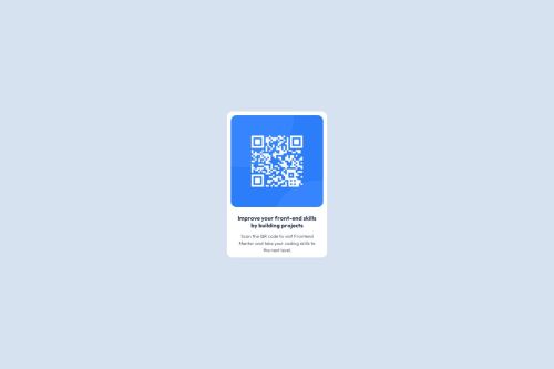
- For the image
<img src="images/image-qr-code.png" alt="">, please add a meaningfulalttext since the image is part of the main content. Alt text helps improve accessibility and ensures the content is understandable for all users, including those relying on screen readers. - Example: If the image represents a QR code for a specific action or information, you can write something like:
<img src="images/image-qr-code.png" alt="QR code description or action."> - For decorative images, leaving the
altattribute blank is the right approach, so you're already following best practices there. ✅
- For the image
-
Code Clarity and Consistency
- Your code is already clean, but maintaining consistency in formatting and comments can further enhance readability for collaborators. For instance, a brief comment explaining the purpose of key sections could help future developers understand your work quickly.
Overall, you're doing fantastic work! 🚀 Keep it up 😊
Cheers,
AakashMarked as helpful -


Join our Discord community
Join thousands of Frontend Mentor community members taking the challenges, sharing resources, helping each other, and chatting about all things front-end!
Join our Discord