Submitted about 1 year agoA solution to the Intro component with sign-up form challenge
Sign-Up Form
accessibility

@KapteynUniverse
Solution retrospective
What are you most proud of, and what would you do differently next time?
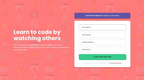
This was my fifth challenge, completed 2 months ago, without JS. I revisited the code now, focusing on the form. I added labels, some ARIA attributes, autocomplete and hints for better accessibility and UX. Also, the TOS and button text had poor contrast ratios, so I changed them. Reduced 4 media query to 1.
What specific areas of your project would you like help with?Any feedback is appreciated. Probably white texts on the light red background also has bad contrast but i can't see that on the dev tools.
Code
Loading...
Please log in to post a comment
Log in with GitHubCommunity feedback
No feedback yet. Be the first to give feedback on Asilcan Toper's solution.
Join our Discord community
Join thousands of Frontend Mentor community members taking the challenges, sharing resources, helping each other, and chatting about all things front-end!
Join our Discord