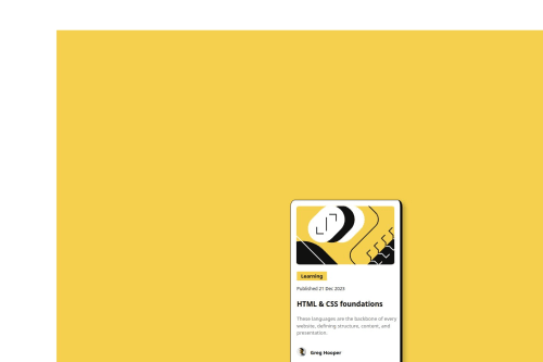
Simple blog preview card page solved using basic HTML & CSS elements.

Solution retrospective
One of the things I am most proud of in creating my Blog Preview Card project is how I was able to combine clean, structured HTML with appealing CSS to design a visually engaging and functional webpage. The carefully styled layout, including the central container with soft shadow effects, rounded corners, and an eye-catching hover interaction on the "HTML & CSS Foundations" header, brings the page to life. The use of the Figtree font throughout adds a modern, professional feel, while small touches, like the avatar image and date section, enhance the blog’s overall look. If I were to do things differently next time, I would focus on adding more interactive features, such as a comment box, theme toggle, or animated transitions, to improve user engagement and give the project even more dynamic functionality. Overall, this project has been a great exercise in web design and a rewarding step forward in building sleek, interactive front-end components.
What challenges did you encounter, and how did you overcome them?One of the challenges I encountered while creating my Blog Preview Card was ensuring that the container's layout appeared balanced and centered across different screen sizes. Initially, the container looked off-center and uneven, especially when viewed on larger screens, due to improper margin settings and a lack of responsive design considerations. To overcome this, I adjusted the margins and padding values, implemented a flexible box model using display: flex, and fine-tuned the layout with relative units like percentages instead of fixed pixels. By doing this, I achieved a more centered, cohesive design that adapts smoothly to various screen sizes. This challenge taught me the importance of responsiveness in modern web design and how small tweaks can make a big difference in the overall user experience.
What specific areas of your project would you like help with?One specific area of my project where I would appreciate some help is improving the user experience when the live URL is opened. Currently, when the page loads, it doesn't automatically center the view on the card container, which is the main focus of the design. Instead, it seems to open at a random section of the page, requiring manual scrolling to see the content properly.
If anyone could explain how to adjust the settings so that, upon loading, the page zooms in and centers on the card container, I would be grateful. Whether it involves CSS tweaks, JavaScript, or viewport adjustments, I'd love to learn the best practice for making sure users immediately see the container front and center when they open the page.
Please log in to post a comment
Log in with GitHubCommunity feedback
No feedback yet. Be the first to give feedback on jad alromhein's solution.
Join our Discord community
Join thousands of Frontend Mentor community members taking the challenges, sharing resources, helping each other, and chatting about all things front-end!
Join our Discord