Skip to content
  • Unlock Pro
  • Log in with GitHub
Solution
Submitted 7 months ago

Simple HTML & CSS classes

Ricardo Castillo•10
@ricardoacz
A solution to the Recipe page challenge
View live sitePreview (opens in new tab)View codeCode (opens in new tab)

Solution retrospective


What are you most proud of, and what would you do differently next time?

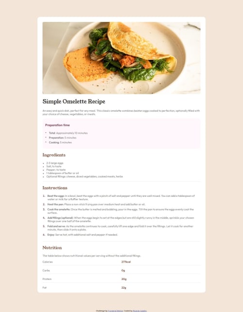
I was able to create the list of nutrition properties and values by using floats.

What challenges did you encounter, and how did you overcome them?

I have used floats before, but it has been a while and I was struggling to get it right.

After a lot of trying and error, MDN pages and some YouTube videos, it worked. But I want to practice more, because they are tricky.

What specific areas of your project would you like help with?
  • How to properly write media queries to cover all devices?
  • When should you use padding vs margin when moving elements?
Code
Couldn’t fetch repository

Please log in to post a comment

Log in with GitHub

Community feedback

  • Dias•140
    @adambeckercodes
    Posted 7 months ago

    Hello, @ricardoacz!

    Good job! But I see that you struggled with matching your solution with the design. To ensure your elements perfectly match the design, you can use the PerfectPixel extension for Chrome. It allows you to overlay a design image on top of your layout and fine-tune your styles for pixel-perfect alignment. This is especially useful when you’re trying to match exact sizes and spacing.

    Regarding your questions:

    To write effective media queries, it’s best to focus on the breakpoints where your design starts to look awkward, rather than targeting specific devices. Here are some commonly used breakpoints as a guideline:

    /* Extra small devices (phones) */
    @media (max-width: 575px) { ... }
    
    /* Small devices (portrait tablets) */
    @media (min-width: 576px) and (max-width: 767px) { ... }
    
    /* Medium devices (landscape tablets) */
    @media (min-width: 768px) and (max-width: 991px) { ... }
    
    /* Large devices (laptops/desktops) */
    @media (min-width: 992px) and (max-width: 1199px) { ... }
    
    /* Extra large devices (large desktops) */
    @media (min-width: 1200px) { ... }
    

    These are just examples, you can find a lot more in the internet. Adjust the styles at these points based on how your layout behaves, ensuring a smooth and responsive user experience.

    Use Padding: When you want to create space inside an element, between the element’s content and its border. For example, adding space around text inside a button or card.

    Use Margin: When you want to create space outside an element, between it and other elements. For example, spacing between two cards or separating a header from the main content. A general rule is: Padding affects the inside of an element, Margin affects the outside.

    Let me know if you have more questions—I’m happy to help! 😊

    Marked as helpful

Join our Discord community

Join thousands of Frontend Mentor community members taking the challenges, sharing resources, helping each other, and chatting about all things front-end!

Join our Discord
Frontend Mentor logo

Stay up to datewith new challenges, featured solutions, selected articles, and our latest news

Frontend Mentor

  • Unlock Pro
  • Contact us
  • FAQs
  • Become a partner

Explore

  • Learning paths
  • Challenges
  • Solutions
  • Articles

Community

  • Discord
  • Guidelines

For companies

  • Hire developers
  • Train developers
© Frontend Mentor 2019 - 2025
  • Terms
  • Cookie Policy
  • Privacy Policy
  • License

Oops! 😬

You need to be logged in before you can do that.

Log in with GitHub

Oops! 😬

You need to be logged in before you can do that.

Log in with GitHub

How does the accessibility report work?

When a solution is submitted, we use axe-core to run an automated audit of your code.

This picks out common accessibility issues like not using semantic HTML and not having proper heading hierarchies, among others.

This automated audit is fairly surface level, so we encourage to you review the project and code in more detail with accessibility best practices in mind.

How does the CSS report work?

When a solution is submitted, we use stylelint to run an automated check on the CSS code.

We've added some of our own linting rules based on recommended best practices. These rules are prefixed with frontend-mentor/ which you'll see at the top of each issue in the report.

The report will audit all CSS, SCSS and Less files in your repository.

How does the HTML validation report work?

When a solution is submitted, we use html-validate to run an automated check on the HTML code.

The report picks out common HTML issues such as not using headings within section elements and incorrect nesting of elements, among others.

Note that the report can pick up “invalid” attributes, which some frameworks automatically add to the HTML. These attributes are crucial for how the frameworks function, although they’re technically not valid HTML. As such, some projects can show up with many HTML validation errors, which are benign and are a necessary part of the framework.

How does the JavaScript validation report work?

When a solution is submitted, we use eslint to run an automated check on the JavaScript code.

The report picks out common JavaScript issues such as not using semicolons and using var instead of let or const, among others.

The report will audit all JS and JSX files in your repository. We currently do not support Typescript or other frontend frameworks.

Oops! 😬

You need to be logged in before you can do that.

Log in with GitHub