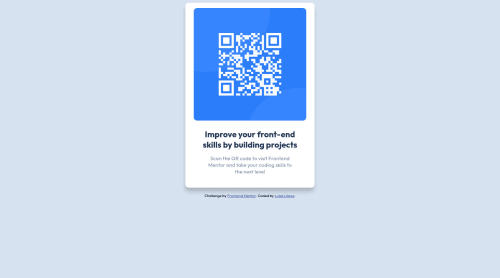
Simple HTML and CSS solution

Please log in to post a comment
Log in with GitHubCommunity feedback
- @shakhboz-shukhrat
Hello there👋! Congratulations on completing this challenge!
The code looks fine and there are no errors. However, there are some ways to improve the code.
There is no issue with the "@import" rule that's been used, but it's better to move it to the top of the CSS file.
The use of "-webkit-box-shadow" and "-moz-box-shadow" can be removed since "box-shadow" is now well-supported across all major browsers.
The width of ".card__text p" can be given in terms of the "em" unit, as it makes the width more consistent across different font-sizes.
Here's the improved code:
@import url("https://fonts.googleapis.com/css2?family=Outfit:wght@400;700&display=swap");

:root {
  --white: hsl(0, 0%, 100%);
  --light-gray: hsl(212, 45%, 89%);
  --grayish-blue: hsl(220, 15%, 55%);
  --dark-blue: hsl(218, 44%, 22%);
}

/* Define variables first */

body {
  font-family: "Outfit", sans-serif;
  background-color: var(--light-gray);
  display: grid;
  place-items: center;
}

/* Then write other CSS rules */

.card {
  height: 500px;
  width: 340px;
  background-color: var(--white);
  border-radius: 10px;
  display: flex;
  flex-direction: column;
  justify-content: space-evenly;
  align-items: center;
  padding: 16px;
  box-shadow: -1px 12px 11px -1px rgba(0, 0, 0, 0.2);
}

.card__qr {
  display: flex;
  justify-content: center;
  align-items: center;
  margin: 8px;
  height: 100%;
}

.card__qr img {
  border-radius: 10px;
  width: 100%;
}

.card__text {
  display: flex;
  flex-direction: column;
  align-items: center;
  text-align: center;
  padding: 16px;
}

.card__text h2 {
  color: var(--dark-blue);
  margin: 0;
}

.card__text p {
  font-size: 15px;
  color: var(--grayish-blue);
  width: 20em;
}
Anyway, your solution is great. Hope you will find this helpful. Happy coding!
Marked as helpful

Join our Discord community
Join thousands of Frontend Mentor community members taking the challenges, sharing resources, helping each other, and chatting about all things front-end!
Join our Discord