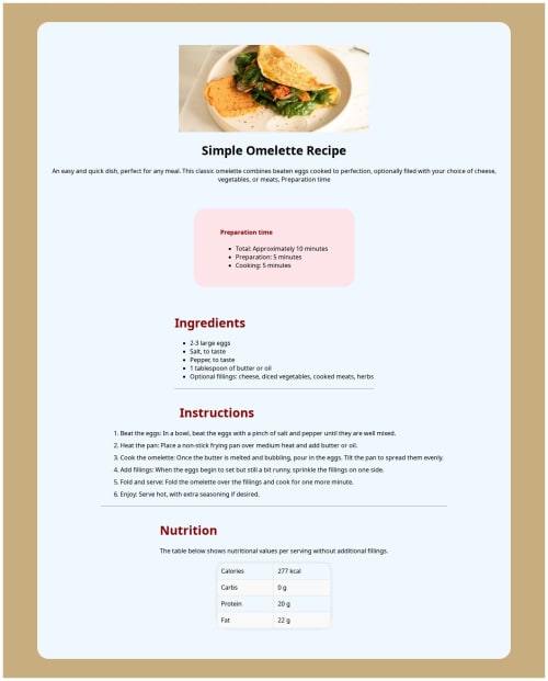
Simple recipe layout using HTML5 and custom CSS styling

Solution retrospective
I’m proud that I was able to complete the project layout fully and style it with clean CSS. I followed a consistent structure using Flexbox, and I managed to deploy the project successfully to Vercel. Next time, I would improve the accessibility of the page and add more responsiveness for smaller screens like mobile devices.
What challenges did you encounter, and how did you overcome them?The main challenge I faced was organizing the CSS and adjusting the layout properly using flex-direction, margins, and padding. It took some trial and error to get the design to match the reference layout. Another challenge was the deployment process with Git and Vercel. After a few mistakes, I was able to fix file names and link paths to make the site work properly online.
What specific areas of your project would you like help with?i would appreciate feedback on:
The structure of my HTML (did I use semantic tags properly?)
My CSS organization and best practices (e.g. naming, layout)
How to improve responsiveness for tablets and phones
Any tips on improving overall design consistency and spacing
Please log in to post a comment
Log in with GitHubCommunity feedback
- @Ayokanmi-Adejola
I've had a look at your Omelette Recipe page solution, and it's a really solid effort! You've done a great job implementing the design.
Here's some feedback to help you refine it even further, covering both strengths and areas for potential enhancement:
What I liked :
- The overall design is clean and well-structured, and it looks very close to the original Frontend Mentor challenge design.
- The responsiveness is excellent; the layout adapts smoothly and beautifully across different screen sizes, from desktop to mobile.
- You've done a good job with the basic HTML structure, making it easy to read.
Areas for Improvement :
-
HTML Semantics & Structure:
- For your lists (e.g., ingredients, instructions, nutrition), ensuring you use the correct HTML tags like
<ul>for unordered lists (ingredients, preparation) and<ol>for ordered lists (instructions) with<li>for list items will improve both meaning and accessibility. - Consider using
<section>or<article>tags for logical content groupings like the "Preparation time," "Ingredients," "Instructions," and "Nutrition" sections. This provides better semantic meaning to your document. - Using
<h2>or<h3>for subheadings within the recipe (like "Ingredients" or "Instructions") after your main<h1>for "Simple Omelette Recipe" will create a clear content hierarchy, which is good for SEO and screen readers.
- For your lists (e.g., ingredients, instructions, nutrition), ensuring you use the correct HTML tags like
-
CSS Best Practices:
- You could explore using CSS variables for colors, font families, and common spacing values. This makes your stylesheet easier to manage and update across the project.
- Reviewing your CSS for any highly specific or deeply nested selectors. Sometimes, simpler selectors can achieve the same result and make your CSS more maintainable.
-
Accessibility Considerations:
- For images, ensure you have meaningful
altattributes (e.g.,alt="Delicious omelette on a plate"instead of justalt="omelette"). This helps users with screen readers understand the image content. - Confirm that your text color contrast meets WCAG guidelines, especially for smaller text or text on background colors, to ensure readability for everyone.
- For images, ensure you have meaningful
In Summary:

This is a really strong foundation for the Omelette Recipe page, You've nailed the visual design and responsiveness. Focusing on enhancing the HTML semantics and applying a few CSS best practices will make your solution even more robust and accessible.

Keep up the great work!

Join our Discord community
Join thousands of Frontend Mentor community members taking the challenges, sharing resources, helping each other, and chatting about all things front-end!
Join our Discord