Not Found
Not Found
Not Found
Not Found
Not Found
Not Found
Not Found
Not Found
Not Found
Not Found
Not Found
Not Found
Not Found
Not Found
Not Found
Not Found
Not Found
Not Found
Not Found
Not Found

Submitted

Simple Recipe Page Design Preview

Jedy++ 70

@Jedyokey

Desktop design screenshot for the Recipe page coding challenge

This is a solution for...

  • HTML
  • CSS
1newbie
View challenge

Design comparison


SolutionDesign

Solution retrospective


I would like to sort an issue in this project I worked on. The border-bottom below "Ingredients and Instructions" sections are taking the full screen width in tab and mobile screens unlike the desktop screen were the border-bottom below those sections are perfectly centralized only occupying the width of the contents and not the entire screen width. I have tried all I could to fix this problem on mobile and tab screens but I can't pin-point where the problem is coming from. Thanks in advance!

Community feedback

Jedy++ 70

@Jedyokey

Posted

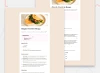
Thank you! I appreciate the response in taking time to review the code. So for the .flex-container class, I edited the padding

.flex-container {
        width: 100%;
        padding-left: 15px;
        padding-right: 15px;
        border-radius: 0;
    }```
as well as the image div
.img-bg {
        margin: -30px -30px 0 -30px;
    }```
The issue is not solved perfectly but this is the closest thing I can get
0
Carl 815

@CarlHumm

Posted

Hi Jedy.

Mobile/Tablet CSS

@media screen and (max-width: 992px)
.flex-container {
    width: 100%;

Desktop CSS

.flex-container {
    width: 50%;
    margin: auto;
}

Your CSS Explained

The media query sets the flex-container to 100% width on any resolution less than 992px. So, tablets/mobiles. Because this container contains all your sections, and your sections do not have a width set, they will take up 100% of space available in .flex-container and span the full page width.

For devices above 992px in resolution, like desktops, they will instead have this container set to 50% and a margin: auto applied to center it. As you can guess, this would also limit the parents children (sections) to a max width of 50% of the viewport width, and center them.

By limiting the width of these sections to 50%, and centering them, their borders also only take up this amount of space. The sections are not "occupying the width of their contents" but instead occupying the width of their parent, which is .flex-container, which is 50%.

What should you do?

If you don't want the border/sections to take up full width on mobile you could:

  1. Set a different width for flex-container
  2. Add margin/padding to body element
  3. Set max-widths for nested sections

Hope this helps, feel free to ask any questions.

0

Please log in to post a comment

Log in with GitHub
Discord logo

Join our Discord community

Join thousands of Frontend Mentor community members taking the challenges, sharing resources, helping each other, and chatting about all things front-end!

Join our Discord