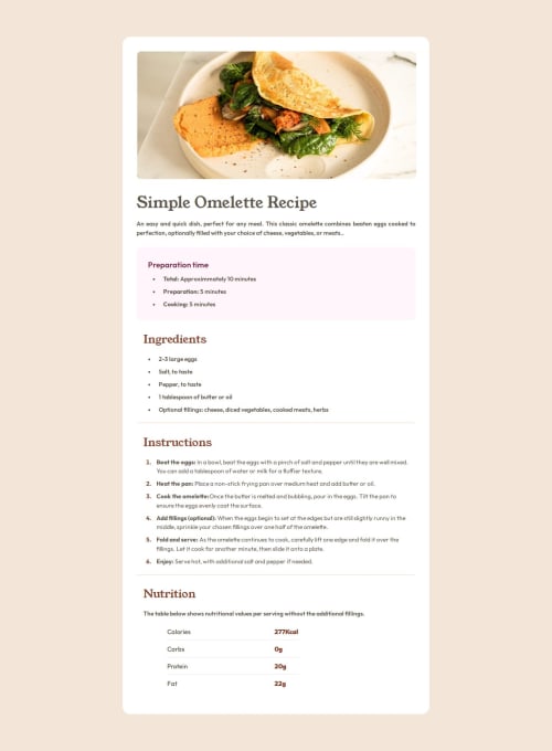
simple recipe page with 3 versions (mobile, tablet and desktop)

Solution retrospective
I’m happy to have completed this challenge by creating versions that are nearly identical to the original for desktop, tablet, and mobile. I also honed my skills in manipulating tables using pseudo-classes like :last-child and :nth-child. Additionally, I’m pleased with the customization I achieved for unordered (ul) and ordered (ol) lists.
A lot of customization, including lists, tables, and handling different values for various selectors, is needed to achieve a responsive design. I think a moment of hindsight is necessary at this stage to see how I can move forward and improve.
What specific areas of your project would you like help with?idea and principles of responsive design and a methodology to work with (mobile first principle, best practice, ...etc.)
Please log in to post a comment
Log in with GitHubCommunity feedback
No feedback yet. Be the first to give feedback on Djamel1133's solution.
Join our Discord community
Join thousands of Frontend Mentor community members taking the challenges, sharing resources, helping each other, and chatting about all things front-end!
Join our Discord