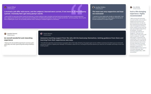
Submitted 4 months agoA solution to the Testimonials grid section challenge
simple responsive solution using flexbox

@Fayhild
Solution retrospective
What are you most proud of, and what would you do differently next time?
I did it quicker than expected, a big improvement using background-url instead of html img elements. I added a media query to improve the design for devices from 800px to 1440px wide. I didn't focused on the font-size, so yeah, it could definitely be improved. I also could use flex-wrap instead of media queries maybe ? This proves to me that I don't really need CSS Grid for such a design if I'm comfortable with Flexbox.
Code
Couldn’t fetch repository
Please log in to post a comment
Log in with GitHubCommunity feedback
- P@wtfkimi
Have you even looked at the design??? Well, like, if you give such crap to the client, no one will pay you for the work, my advice is to look at the design and your work

Join our Discord community
Join thousands of Frontend Mentor community members taking the challenges, sharing resources, helping each other, and chatting about all things front-end!
Join our Discord