


Vanza Setia• 27,835
@vanzasetia
Posted
Greetings, Yuenu! 👋
Congratulations on finishing this challenge! 🎉
I have some feedback on this solution:
- Accessibility
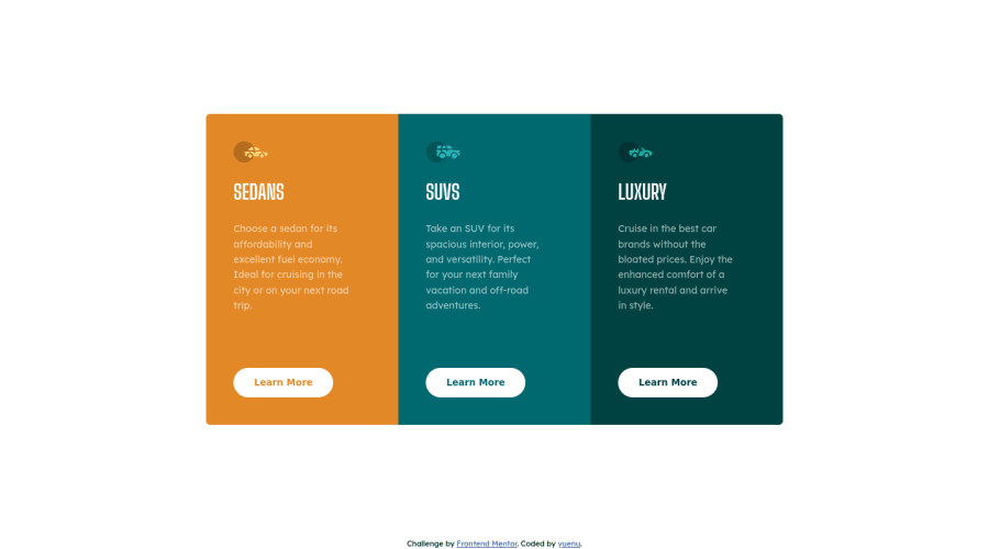
- Good job on using
mainlandmark! 👍 - For your attribution, you wrap it with
footer. - For any decorative images, each
imgtag should have emptyalt=""andaria-hidden="true"attributes to make all web assistive technologies such as screen reader ignore those images. In this case, all images are decorative only. - The
Learn Morebuttons should be links because if this is a real website, those buttons will navigate the user to another webpage. - FYI, anchor tags are for navigation - moving to different pages or content on the same screen, while the
buttonelements are for actions like opening a modal, submitting a form, toggling element, etc. - Next time, if you are using
buttonelement, always specify thetypeof thebutton. By doing that, you prevent the button from behaving unexpectedly.
- Good job on using
- Styling
- Currently the headings have a different font family from the design. Even though on design comparison you have used the correct font family.
- Best Practice (Recommended)
- I would recommend reducing the indentation of your code because right now it's hard to read your code. Usually, 2 - 4 spaces should be enough.
Overall, your solution looks good on my mobile view (both landscape and portrait) and desktop view. Good job! 👍
That's it! Hopefully, this is helpful! 😁
0
yuenu• 505
@yuenu
Posted
@vanzasetia Thank you for your comments and feedback, it's really helpful
1

