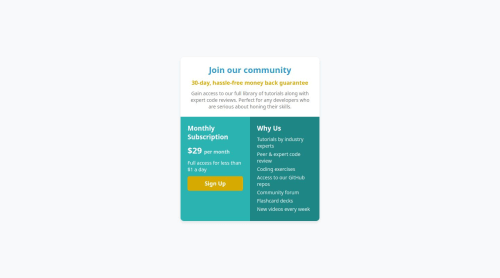
single-grid-component

Solution retrospective
I am proud of successfully structuring the Single Price Grid Component using HTML & CSS. Next time, I would optimize the responsiveness further with CSS Grid & Flexbox.
What challenges did you encounter, and how did you overcome them?Aligning the grid was challenging, but I fixed it using CSS Grid and Flexbox.
What specific areas of your project would you like help with?I need help with CSS responsiveness and alignment issues.
Please log in to post a comment
Log in with GitHubCommunity feedback
- @benssssss
Remove the Width of the Main Container
To fix the layout issue, remove the fixed width from your main container (.container) and define sizes directly on the specific sections (.top-section and .bottom-section). It seems you set the width this way to optimize for mobile, but it ends up causing issues on desktop.
/* Remove the fixed width */
.container {
    /* width: 400px; */
}

/* Add specific dimensions to sections */
.top-section {
    width: 600px;
    height: 200px;
}
Aligning the Sections
You applied display: flex; to the .bottom-section, but this doesn't affect the layout as intended. Instead, apply display: flex directly to the specific elements (.left-box and .right-box) to align them properly.
To center elements vertically, use align-items, and to center horizontally, use justify-content. Since the default flex direction is row, and you need it in column, add flex-direction: column as well:
.left-box {
    display: flex;
    flex-direction: column;
    justify-content: center;
    align-items: center;
}
.right-box { display: flex; flex-direction: column; justify-content: center; align-items: center; }Centering Content in the Top Section You can also add display: flex to the .top-section. Use flex-direction: column to stack elements vertically and justify-content: center to center them. Since you want the content aligned to the left horizontally, use align-items: start:
.top-section {
    display: flex;
    flex-direction: column;
    justify-content: center; /* Vertical centering */
    align-items: start; /* Horizontal alignment to the left */
}
will look very good, but if you want change screen size it will break,
i cant access your GitHub, so cant write the responsive, a hint is use a media-queries, long story short, allow you make changes on CSS styles based in the screen size
i noticed that you center all texts, this isn't very good, try align on the corners too
Hope this give some help,
continue coding!

Join our Discord community
Join thousands of Frontend Mentor community members taking the challenges, sharing resources, helping each other, and chatting about all things front-end!
Join our Discord