Single Price Component with HTML and CSS

Solution retrospective
Hi Everyone,
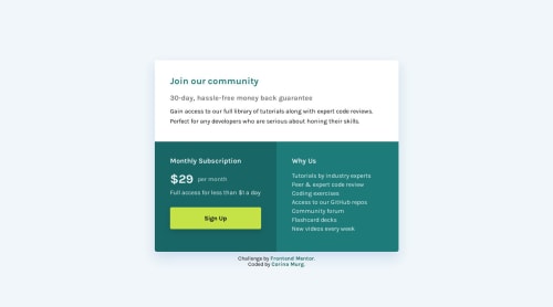
I am learning React and I picked this easy challenge to practice my skills, but now I’m a bit distracted by its design. The original design is beautiful but it does not meet the contrast ratio guidelines, so I wanted to try out different shades of green. The page does pass the contrast ratio test now, but the design is less … appealing.
Questions: Do you find my design acceptable? If not, what would you change? Would it work better if I replaced the green with a different color?
I completed this version with just plain HTML and CSS, but would like to try a different color scheme with the React version.
Thank you in advance for you feedback!
Please log in to post a comment
Log in with GitHubCommunity feedback
- @NehalSahu8055
Hello Coder 👋.
Congratulations on successfully completing the challenge! 🎉
Few suggestions regarding design.
-
Responsive 💯
-
Instead of having
multiple css filestry tomergethem in amain css file, it would impact a lot in thespeedofloading. -
Try to add
accessibility featureslike aria, sr-only, title.
aria : link
.sr-only:link
I hope you find this helpful.
Happy coding😄
Marked as helpful -
- @Gesiere
Great Work, your layout is perfect so is your design, Where my issues stands, would be the colors not matching the actual design. Compare the design that was given look at the colors and note where they are not similar.
While the your layout is fine, you are not matching the colors in the design, all the same great work.
And agreeing with the comment above some box-shadow would make the card section more pronounce.
Marked as helpful - @devendra-alt
Hello @Cor-Ina, Great Work,
I have some suggestions for you,
- you can add
box-shadowto the infocard. - you can use the
<article>tag in place of<main class="price"><main/>, it was a better choice from the website accessibility point-of-view. - you can use descriptive class names to make your code more maintainable and consistent.
Marked as helpful - you can add
- @0xabdulkhaliq
Hello there 👋. Congratulations on successfully completing the challenge! 🎉
- I have other recommendations regarding your code that I believe will be of great interest to you.
BODY MEASUREMENTS 📐:
- Use
min-height: 100vhforbodyinstead ofheight: 100vh. Setting theheight: 100vhmay result in the component being cut off on smaller screens, such as mobile devices in landscape orientation
- For example; if we set
height: 100vhthen thebodywill have100vhheight no matter what. Even if the content spans more than100vhof viewport.
- But if we set
min-height: 100vhthen thebodywill start at100vh, if the content pushes thebodybeyond100vhit will continue growing. However if you have content that takes less than100vhit will still take100vhin space.
.
I hope you find this helpful 😄 Above all, the solution you submitted is great !
Happy coding!


Join our Discord community
Join thousands of Frontend Mentor community members taking the challenges, sharing resources, helping each other, and chatting about all things front-end!
Join our Discord