Submitted about 3 years agoA solution to the Single price grid component challenge
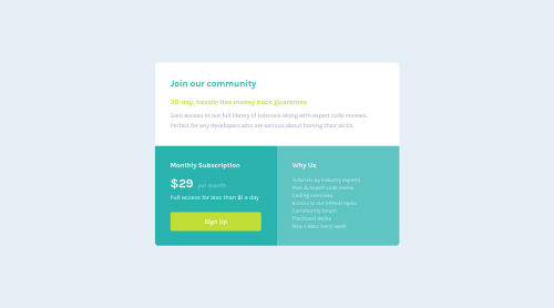
Single price grid component
vite

@rezajaber
Solution retrospective
Hey! I am Reza 🙂 I just recently started to learn web-development and would like to get every little help out there. So if you have the time, feel free to look over my project/projects and give me some advice to get better as fast as possible.
Project #10: Some questions for this "Single-Price-Grid" project:
- Did I center everything right, or was there a easier way?
- Was there a easier way to design some things in way less code?
- What did I do completely wrong, and just have luck within this project?
- What would you do different?
I appreciate it✌️
Code
Loading...
Please log in to post a comment
Log in with GitHubCommunity feedback
No feedback yet. Be the first to give feedback on Reza Jaber's solution.
Join our Discord community
Join thousands of Frontend Mentor community members taking the challenges, sharing resources, helping each other, and chatting about all things front-end!
Join our Discord