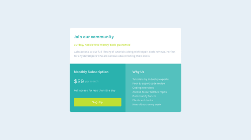
Responsive bootstrap layout

Solution retrospective
Hey People!
So I am doing a little project now, I am remaking all my so far done challenges with tools I have learnt since then, this one is my first actualy try in using bootstrap in any of my projects (I guess it obvious if you look at the code :D) so I would very much be in your debt for any constructive comments.
My obvious question is: Am I using bootstrap instead of media queries the right way? The layout changes from width of sm and up to desktop view, I have tried to implement it and it seems to work but Im not sure this is best practice.
I have tried using rem mostly as unit as I have read on github best practice for units that it scales pretty well, and it seems it indeed does, the layout is fully responsive as far as I can tell.
Thank in advance as usual!
Daniel
Please log in to post a comment
Log in with GitHubCommunity feedback
No feedback yet. Be the first to give feedback on Daniel Dekany's solution.
Join our Discord community
Join thousands of Frontend Mentor community members taking the challenges, sharing resources, helping each other, and chatting about all things front-end!
Join our Discord