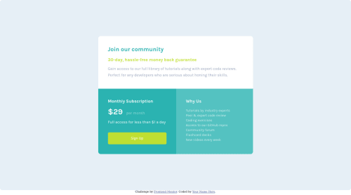
Single price grid component

Solution retrospective
Can I use Grid in Flexbox components?
Please log in to post a comment
Log in with GitHubCommunity feedback
- @Chaffexd
Hey Momin,
To answer your question about using grid in flex or vice-versa, yes you absolutely can. They work extremely well with each other actually!
I strongly recommend you taking a look at https://developer.mozilla.org/en-US/docs/Web/CSS/Pseudo-classes so you can help bring your projects to life.
Good job!
Marked as helpful - @Hassiai
Every html must have <h1> to make it accessible. Always begin the heading of the html with <h1> tag wrap the sub-heading of <h1> in <h2> tag, wrap the sub-heading of <h2> in <h3> this continues until <h6>, never skip a level of a heading.
The body has a wrong background-color. Use the colors that were given in the styleguide.md found in the zip folder you downloaded.
There is no need to style the main, to center .card on the page using grid, add min-height:100vh; display: grid place-items: center to the body
body{
min-height: 100vh;
display: grid;
place-items: center;
}
Give .card a fixed max-width value , display: grid and grid-template-columns:1fr 1fr; in the mobile design change the value of the grid-template: column to 1fr;
max-width: 600px.Use relative units like rem or em as unit for the padding, margin, width values and preferably rem for the font-size values, instead of using px which is an absolute unit. For more on CSS units Click here
Hope am helpful.
Well done for completing this challenge. HAPPY CODING
Marked as helpful - @Guille-Sanchez
Hi! To my knowledge you can totally use grid inside flexbox elements. Think of each element as a container, the flexbox -grid attributes only modify the disposition and size of the element. But still, each conserves the state of being a simple container.
One recommendation I would give you is to use Mozilla as your browser when debugging flex-grid items. Mozilla devtools is better optimize for dealing with them, look into it, best luck!
Marked as helpful


Join our Discord community
Join thousands of Frontend Mentor community members taking the challenges, sharing resources, helping each other, and chatting about all things front-end!
Join our Discord