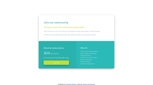
Submitted over 4 years agoA solution to the Single price grid component challenge
Single Price Grid Component, HTML and CSS, Flex-box for layout

@monicamclaughlan
Solution retrospective
First time implementing flex-box in layout and also first time hopefully successfully using a media query? Still learning and all feedback is welcome! Thanks!
Code
Loading...
Please log in to post a comment
Log in with GitHubCommunity feedback
No feedback yet. Be the first to give feedback on Monica's solution.
Join our Discord community
Join thousands of Frontend Mentor community members taking the challenges, sharing resources, helping each other, and chatting about all things front-end!
Join our Discord