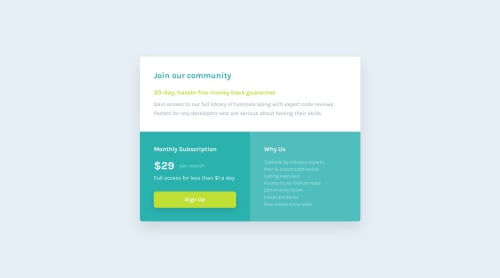
Single price grid component

Solution retrospective
I’d really appreciate any feedback on my solution, especially regarding code structure, accessibility and responsiveness.
Please log in to post a comment
Log in with GitHubCommunity feedback
- @KapteynUniverse
Hey Tetiana, nice job.
Your usage of landmarks and headings and also responsiveness looks good. Sizes are kinda odd tho, like
gap: 0.46rem;but i guess you wanted to make pixel-perfect like Yacoub said.For accessibility i see 2 issues:
-
Everything has a bad color ratio, which is not your doing but the design is bad for that matter. For the future; you can see this by hovering any text with inspect tool and look for the contrast. You can check here for that criteria
-
Outline and border none is not good for accessibility. When i try to focus "Sign Up" button with the tab button on keyboard, i can't see if i am on the button. So either you want to use
border-color: transparent;oroutline-color: transparent;or need to make a custom style for that.
Marked as helpful -
- @YacoubDweik
Good job!
Always wanted to ask u, where do you get all these media queries values from? 640px and 426px (not 425px lol haha). Like I've never seen anyone uses these values?!?
Also why on earth would you give min-height to that card article?! You always give heights and widths but in terms of max-width and min-height which won't be a problem that causes any overflow but it will look odd if the content gets smaller or if the font size gets smaller, I think you want to achieve pixel-perfect designs like me when I started solving these challenges haha. Just wanna say weel done and keep it up Tetiana!
Marked as helpful


Join our Discord community
Join thousands of Frontend Mentor community members taking the challenges, sharing resources, helping each other, and chatting about all things front-end!
Join our Discord